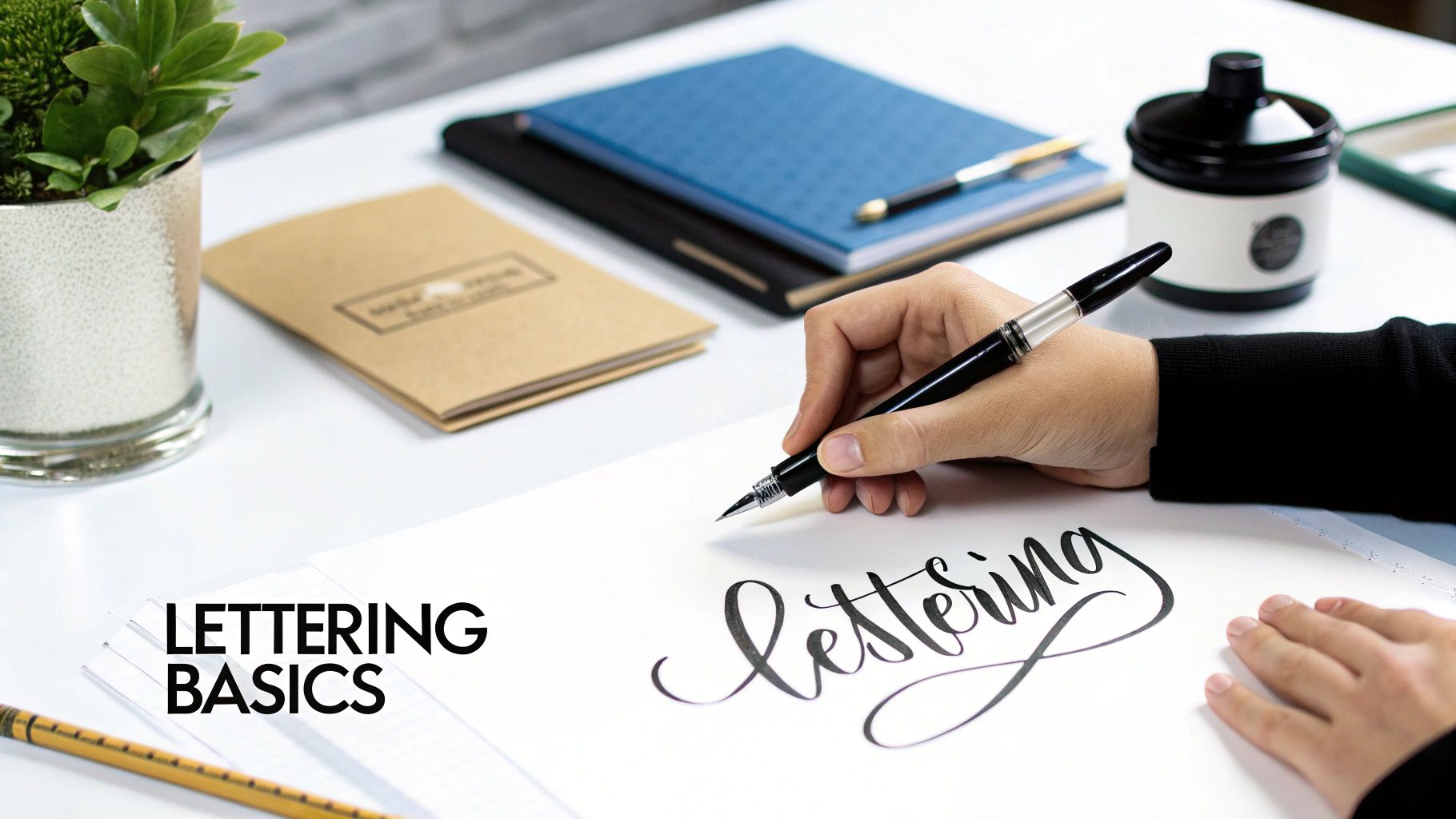
A lettering font style is a typeface designed to look and feel like hand-drawn art. It’s all about capturing the personality and wonderful imperfections of human creativity. These fonts are a world away from your standard, sterile typography, offering a unique blend of artistry and digital function that injects a personal touch into any design.
What Exactly Is a Lettering Font Style?
Have you ever seen a logo or an invitation where the text just felt beautifully crafted, almost like a tiny piece of art? That’s the magic of a good lettering font style. But to really get what makes them special, we need to untangle three closely related ideas: lettering, calligraphy, and typography.
Think of it this way: hand-lettering is basically drawing pictures of words, where every single letter is a unique illustration. Calligraphy is the art of beautiful, disciplined writing, using specific tools and strokes. Typography, on the other hand, is the mechanical process of arranging pre-made letters—the fonts on your computer.
A lettering font style lives in that fascinating space in between. It's technically a font (typography), but one that’s been painstakingly designed to mimic the organic, bespoke feel of hand-lettering.
The Stencil Analogy
Let’s imagine you’re painting a sign to make this crystal clear.
- Typography is like using a stencil set. Every letter ‘A’ you paint will be identical to the last. It’s perfect, repeatable, and efficient.
- Hand-lettering is like drawing each letter ‘A’ freehand. Every single one will have subtle differences, carrying its own unique character and charm.
A lettering font acts as a "perfectly imperfect" stencil—one that was originally created from a freehand drawing. It gives you the consistency of a font while keeping all the warmth and personality of a hand-drawn illustration.
A lettering font isn’t just a collection of characters; it’s a vehicle for emotion and brand identity. It translates the human touch into a digital format, making designs feel more approachable, authentic, and memorable.
This is exactly why these styles are so popular. They bridge the gap between cold, digital text and expressive human art, infusing designs with a specific mood—whether it’s elegant, playful, bold, or rustic.
To see how new font styles come to life in big-brand projects, you can check out the story of Youtube Sans, a brand new font. And now, tools like an AI font generator make it even easier to create styles that capture a brand's unique voice, turning simple text into a powerful visual asset.
The Core Categories of Lettering Fonts
Stepping into the world of lettering fonts can feel a bit like walking into a massive library, where every book has its own unique voice and personality. It can seem overwhelming, but don't worry. We can simplify things by grouping the endless styles into four main families: Serif, Sans-Serif, Script, and Decorative.
Getting to know these core groups is the first big step toward picking the perfect font for any project. Each one has a distinct vibe, shaped by its design and history. Think of it like a film director choosing a camera angle to set a mood—a designer picks a font to stir up a specific feeling. Once you grasp these categories, you'll start making design choices that just feel right.
This diagram breaks it all down, giving you a quick visual guide to the main font families and what makes each one tick.
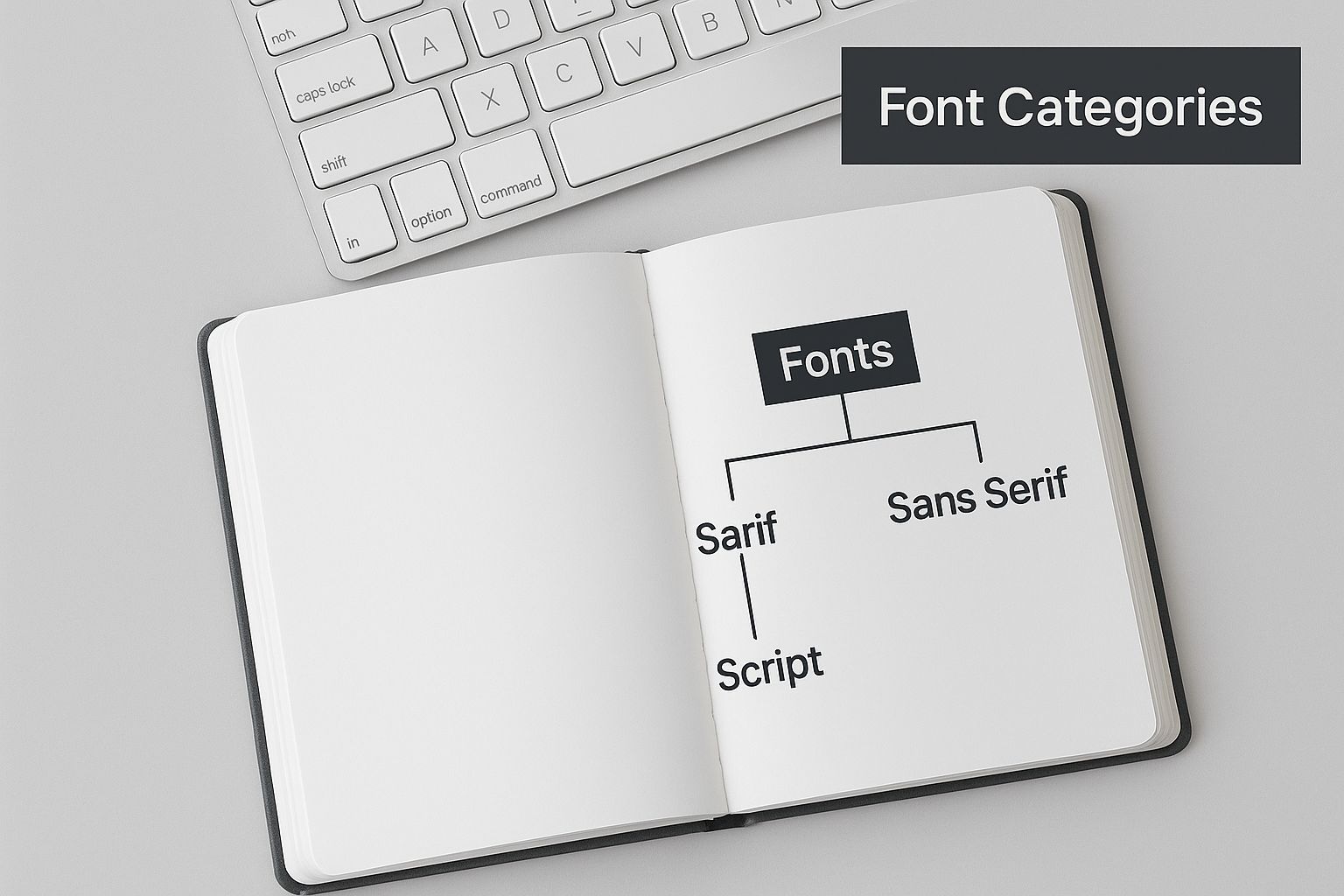
As you can see, it splits the complex world of typography into four clear paths, each leading to a totally different design destination. Let's take a closer look.
To give you a quick cheat sheet, here’s a breakdown of the main lettering font style categories.
Quick Guide to Lettering Font Style Categories
| Style Category |
Defining Characteristics |
Psychological Association |
Best For |
| Serif |
Small "feet" or strokes at the ends of letters. |
Tradition, Reliability, Formality |
Books, newspapers, academic papers, brands with heritage. |
| Sans-Serif |
Clean, unadorned letterforms without "feet". |
Modernity, Simplicity, Clarity |
Websites, mobile apps, corporate branding, signage. |
| Script |
Mimics handwriting with fluid, connected strokes. |
Elegance, Personality, Warmth |
Invitations, luxury brands, social media, personal branding. |
| Decorative |
Unique, expressive, and often unconventional designs. |
Drama, Creativity, Uniqueness |
Logos, headlines, posters, special-purpose designs. |
This table is a great starting point, but let's explore what makes each of these styles so powerful.
Serif Fonts: The Voice of Tradition
Serif fonts are the old guard of the typography world. You can spot them by the small "feet" or strokes attached to the ends of their letters. Think of these serifs like the detailed carvings on a piece of antique furniture—they add a touch of class, history, and reliability. Their roots trace all the way back to Roman carvings, which gives them a feeling of authority and timelessness.
It's no surprise, then, that serif fonts are the top choice for brands and institutions aiming to project heritage and trustworthiness. They are incredibly readable in long blocks of text, which is exactly why they dominate books, newspapers, and academic journals. They feel stable and respectable.
Sans-Serif Fonts: The Essence of Modernity
In complete contrast to their older siblings, Sans-Serif fonts ditch the extra feet—"sans" literally means "without" in French. Their clean, simple lines create a sense of clarity, efficiency, and modernity. By stripping away the ornamentation, they let the message itself shine through without any distractions.
This style's rise is deeply tied to British innovation. The term 'sans-serif' was first used by British type-founder Vincent Figgins in 1828. During the Industrial Revolution, the chaotic streets of Victorian Britain needed bolder, clearer fonts for ads and signs, and sans-serifs were perfect for the job. This functional approach had a massive impact on public typography, from shop posters to the iconic Johnston typeface of the London Underground.
Today, sans-serifs are the go-to for a clean, contemporary feel. They are the workhorses of digital design, perfect for web interfaces, mobile apps, and any brand that wants to come across as direct, approachable, and forward-thinking.
Script Fonts: The Personal Touch
Script fonts capture the fluid, connected strokes of human handwriting, from elegant, flowing calligraphy to fun, casual scribbles. This category is all about bringing a human element into design, making things feel personal, intimate, and artistic. A script font is like getting a handwritten note in an inbox full of emails—it adds instant warmth and character.
Because they’re so expressive, script fonts are ideal for designs that need to convey emotion or elegance.
- Formal Scripts: Think wedding invitations, certificates, and luxury branding. They evoke sophistication and a sense of occasion.
- Casual Scripts: With their friendly, relaxed look, these are fantastic for logos, social media graphics, and packaging that needs a handcrafted feel.
Decorative Fonts: The Bold Statement
Finally, we have the most diverse and expressive category of them all: Decorative fonts. This is the "anything goes" family of typography, where the only rule is to break the rules. Decorative fonts are designed to grab your attention with unique, unusual, and often dramatic designs. They care less about perfect readability and more about making a massive visual splash.
Think of this lettering style like a powerful spice in a recipe—a little goes a long way. They are brilliant for headlines, logos, posters, and any design where the text itself is the main event. The goal is to be unforgettable. If you're hunting for that perfect unique look, an AI font generator can be an incredible tool for cooking up a custom decorative style that nobody else has.
To dive even deeper into the nuances of these styles, check out our guide to the different lettering fonts available today.
A Look at Famous British Lettering Styles
Just like a regional accent can instantly tell you where someone’s from, certain fonts have a distinctly British feel. In the world of lettering, British design has given us some of the most iconic and lasting styles, shaping not just the UK's own visual identity but influencing designers all over the globe. These aren’t just letters on a page; they’re cultural touchstones, carrying a bit of history in every curve and line.

Diving into these styles is like taking a quick trip through British history. From the no-nonsense clarity of old railway signs to the classic covers of Penguin paperbacks, these fonts have worked their way deep into the public consciousness. They tell a story of a nation balancing tradition with modernity, creating a visual voice that’s authoritative yet human—and unmistakably British. That legacy is a goldmine of inspiration for any creative today.
Gill Sans: The Quintessential British Typeface
If you had to pick one lettering font style that just feels British, it’s got to be Gill Sans. Designed by the British sculptor and type designer Eric Gill back in 1928, this typeface quickly became a cornerstone of the nation’s visual culture. It has this fantastic mix of clean, modern lines and a subtle human warmth, which makes it incredibly easy to read and surprisingly friendly.
Its design DNA comes from the Johnston typeface—the famous font of the London Underground—but Gill Sans has a slightly more polished, formal feel. It struck a perfect balance that made it ridiculously versatile, and it was soon adopted all over the country.
You really can't overstate the impact of Gill Sans on British public life. In 1949, it was chosen for all train station signage, cementing its place in the daily commute of millions for nearly 15 years. But it didn't stop at transport. It became the voice of trusted institutions like the BBC, the Royal Air Force, and Penguin Books, whose iconic orange-and-white covers made Gill Sans a symbol of literature for the masses. You can read more about its massive role in British typography on SirGordonBennett.com.
How It Still Influences Modern Design
The legacy of these classic British styles isn't just trapped in history books or on vintage posters. Their core principles—clarity, character, and sheer functionality—are still a huge influence on design today. Modern designers often reach for these heritage fonts when they want to convey a sense of trust, quality, and timeless style.
The enduring appeal of styles like Gill Sans comes down to their perfect balance. They’re clean enough for a corporate website but warm enough for a local café’s menu, proving that great design never really goes out of style.
This timeless quality is a key takeaway for anyone picking a font. The lesson from British typography is that the most powerful lettering font style choices are those that manage to communicate a clear personality while staying incredibly functional. An AI font generator can take these principles and help create modern variations with a classic feel.
Reimagining British Styles with AI
While historical fonts are a fantastic starting point, today’s tools give us new ways to play with and build on this legacy. An AI font generator lets designers and creators take inspiration from classic British aesthetics to generate totally new, custom styles that capture a similar spirit.
Say you want a font with the clarity of Gill Sans but with a more modern, handcrafted vibe. You could use an AI font generator to:
- Blend Characteristics: Mix the clean structure of a British sans-serif with the subtle texture of a hand-drawn script.
- Generate Variations: Create a bunch of options using prompts like "elegant British railway font" or "classic London book cover lettering."
- Customise for Modern Needs: Tweak the weight, slant, and spacing until it perfectly fits a digital app or a new branding project.
This approach is all about honouring the past while creating something fresh and original. It opens up the design process, letting anyone craft a lettering font style that has a sense of history but is built for right now.
How to Choose the Right Lettering Font Style
Picking the perfect lettering font is about so much more than what just looks good. It's a strategic move that fundamentally shapes how people feel about your message. Think of it like choosing an outfit for a first impression. A sharp suit screams professionalism, while a comfy jumper feels friendly and laid-back. Your font choice does the same job, setting the entire tone before anyone reads a single word.
This isn't just about aesthetics; it's about communication. The right font choice works with your message, making it stronger and more memorable. The wrong one? It can create a weird, jarring experience for your audience, completely undermining what you're trying to say. It’s the difference between a design that feels effortless and one that just feels… off.
To get it right, you need to think about a few key things. Let's walk through a simple framework to help you nail down your project's needs and pick a lettering style that doesn't just look amazing but actually works for you.
Define Your Brand's Personality
Before you even think about scrolling through fonts, stop and define your brand's voice. Is it playful and energetic, or serious and authoritative? Are you aiming for elegant and luxurious, or something more rustic and down-to-earth? Your font is one of the most powerful visual cues you have for that personality.
A quirky, hand-drawn decorative font might be absolutely perfect for a creative artisan's brand, but it would feel completely bizarre coming from a financial consultancy. The goal is pure alignment.
- For a modern, clean brand: A sleek sans-serif often hits the mark.
- For a traditional, trustworthy brand: A classic serif font conveys a sense of heritage and reliability.
- For a personal, elegant brand: A flowing script can add that essential human touch.
Try this: jot down three to five adjectives that capture your brand's personality. Keep these words front and centre as you look at different font styles. This simple exercise will be your north star, making sure your final choice is a true reflection of who you are. An AI font generator can even use these adjectives as prompts to suggest styles.
Consider Your Target Audience
Who are you actually talking to? The lettering style that grabs a young, trend-savvy audience will probably be very different from what appeals to an older, more traditional crowd. A font that feels exciting to one group might just look unreadable to another.
For instance, a highly stylised script might be dreamy for a wedding invitation aimed at young couples. But that exact same font would be a terrible choice for a retirement planning brochure, where you need to project clarity and stability above all else.
Think of your font as a non-verbal handshake with your audience. It should feel familiar, welcoming, and appropriate for the conversation you want to have. Your choice should build trust, not create a barrier.
Context Is Everything
Where and how is this font going to be used? The practical side of things is just as important as the creative vibe. A beautiful, delicate script might look stunning on a large poster, but it could easily turn into an illegible smudge when you shrink it down for a mobile app icon.
Ask yourself these crucial questions:
- Print vs. Digital: Is this for a screen or for paper? Some fonts are specifically built for crisp digital readability, while others are at their best in print.
- Headlines vs. Body Text: Are you choosing a font for a big, bold title or for longer paragraphs of text? Decorative and script fonts are usually best kept for headlines, while serifs and sans-serifs are the workhorses of body copy.
- Scalability: How does the font hold up at different sizes? Test it out. You need it to be clear and legible whether it's on a tiny business card or a massive billboard.
The Art of Font Pairing
Hardly any design uses just one font. Font pairing is the skill of combining different styles to create a design that’s both cohesive and visually interesting. A classic, effective strategy is to pair an expressive, eye-catching font with something simple and neutral.
You could, for example, combine a bold decorative headline font with a clean, readable sans-serif for the main text. This creates a clear visual hierarchy, guiding the reader’s eye exactly where you want it to go. The trick is to create contrast without creating conflict. When you start mixing fonts, it’s also crucial to know the usage rights for each one. To make sure you're playing by the rules, you can learn more about font licensing for commercial use in our detailed guide.
And if you’re ever stuck trying to find that perfect match, an AI font generator can be a lifesaver. It can offer smart suggestions or even create a custom font that perfectly complements your main choice, making the whole process a lot smoother.
The Rise of the AI Font Generator
The design world never sits still. Every so often, a new tool pops up that completely changes how we tackle creative work. In the world of lettering, that game-changer is the AI font generator. This tech is rewriting the rules for seasoned designers and everyday creators alike.
Imagine having a creative partner that can instantly bring any lettering style you dream up to life. That’s pretty much what these tools do. They use artificial intelligence to cook up unique, custom typography from simple text descriptions, rough sketches, or style choices you feed them.
Suddenly, bespoke lettering isn’t just for those with years of design training. The technical hurdles are gone, letting pure creativity lead the way and cutting down design time from hours to minutes.
How Does an AI Font Generator Work?
Think of an AI font generator as a super-skilled digital artist that’s studied millions of lettering examples. It learns the core principles of typography—things like kerning, weight, and stroke consistency—and then uses that massive bank of knowledge to create something brand new, based entirely on your instructions.
The process is refreshingly simple. Instead of painstakingly drawing every single letter, you just tell the AI what you’re after. This input can be as simple or as detailed as you like, making it a flexible and intuitive way to create.
- Text Prompts: You can describe the vibe you want in plain English. Think "a vintage, hand-drawn script for a coffee shop logo" or "a bold, futuristic sans-serif for a tech startup." The more detail you give, the closer you'll get to your vision.
- Stylistic Parameters: Many generators let you play with sliders or pick from menus to adjust things like boldness, slant, and decorative flourishes.
- Sketch Inputs: Some of the more advanced tools even let you upload a quick doodle, which the AI then polishes into a professional lettering style.
Once you’ve given your input, the AI gets to work, churning out a whole range of options in seconds. This makes it incredibly easy to experiment and land on the perfect visual voice for your project without all the manual grunt work.
Unlocking New Creative Possibilities
The perks of using an AI font generator go way beyond just saving a bit of time. This technology throws open a door to a whole new world of creative potential, acting as a powerful sidekick for both brainstorming and final execution. For anyone curious about how AI is shaking up visual design in general, checking out an AI Pinterest pin generator is a great way to see how automation is transforming content creation, lettering styles included.
One of the biggest wins is the ability to generate endless variations. If the first result isn’t quite right, you can ask for small tweaks or completely new ideas with a single click. This rapid-fire process encourages you to explore and helps you nail down your ideas in no time.
An AI font generator is more than just a tool for making fonts; it's a creative collaborator. It empowers you to explore typographic ideas that might have been too complex or time-consuming to even attempt by hand, making unique design more attainable than ever.
This tech also makes custom typography accessible to everyone. In the past, getting a unique lettering style meant hiring a specialist designer, which was often slow and pricey. Now, small business owners, social media managers, and bloggers can generate one-of-a-kind fonts that perfectly capture their brand’s personality. Our very own AI Font Generator is a super simple way to dive in and start creating stunning copy-and-paste font images right away.
A Quick Walkthrough Creating a Lettering Style
Let's say you need a logo for a friendly new neighbourhood bakery called "The Rolling Pin." You’re picturing a lettering style that feels warm, inviting, and a little bit rustic. Here’s how you could use an AI font generator to make it happen.
- Define Your Creative Brief: You start with a clear vision. Your keywords are "friendly," "rounded," "script," and "bakery."
- Input Your Prompt: You type a descriptive prompt into the generator, something like: "Create a friendly, rounded script font that looks hand-drawn, suitable for a bakery logo named The Rolling Pin."
- Review the Initial Options: The AI instantly spits out several different takes. One might feel too formal, another too goofy, but a third one looks promising. It has the right warmth, but you think it could be a bit bolder.
- Refine and Iterate: Now you tweak your request. You might add "make it bolder" or "add a subtle texture like a dusting of flour." The AI generates a fresh batch of options based on your new feedback.
- Select and Finalise: After just a few quick rounds, you find it—the perfect lettering style that captures the exact feeling you were going for. The whole process, from that first spark of an idea to a finished design asset, took just a few minutes.
Still Got Questions About Lettering Fonts?
Even with the basics down, a few common questions tend to pop up when you're in the middle of a project. Let's tackle those lingering queries right now, so you can feel totally confident in your design choices. Think of this as your final checklist before you dive in.
We'll clear up some frequent points of confusion and make sure the key ideas from this guide really stick.
What’s the Real Difference Between a Font and a Typeface?
This is easily one of the most common mix-ups in the design world, and for good reason—most people use the terms interchangeably. But there's a small, important distinction that's helpful to know.
Think of it like music: a typeface is the song, while a font is a specific recording of that song in a particular format (like an MP3 or a vinyl record).
A typeface, like Helvetica, is the complete design family—the overall look and feel of the letters. A font, on the other hand, is the specific file you actually use, like Helvetica Bold at 12pt. So, when you choose "Times New Roman" from a dropdown menu, you're picking a typeface. When you narrow it down to "Times New Roman Italic," you've just selected a font.
Getting this right helps you speak the language of design and understand that a lettering style is part of a larger, more versatile family.
Can I Actually Create My Own Lettering Font Style?
Absolutely! And thankfully, it's more doable today than ever before. In the past, creating a font was a seriously technical job, demanding specialised software and a deep, nerdy knowledge of typography. Designers would pour hundreds of hours into drawing each character and perfecting the spacing (kerning).
While the pros still go that route, modern tools have blown the doors wide open for everyone else. You can start by simply hand-drawing your own alphabet, scanning it, and using software to turn it into a working font file. It's an incredible way to create something that’s 100% you.
The fastest and most modern way in? An AI font generator. These tools can take your handwriting, a simple sketch, or even just a text prompt and spin it into a complete, custom lettering font style in minutes. It makes font creation fun, fast, and accessible to anyone, no technical skills needed.
How Many Lettering Fonts Should I Use in a Single Design?
Ah, the classic question. The best advice is almost always "less is more." As a solid rule of thumb, try to stick to two, or at the absolute most, three different fonts. Any more than that, and your design risks looking chaotic, amateurish, and just plain hard to read. Your goal is clarity, not a typographic party gone wrong.
A tried-and-true strategy is to pair two contrasting fonts:
- For your headline: Go with something bold and expressive to grab attention. A cool decorative or script lettering style works perfectly here.
- For your body text: Pick something clean, simple, and super readable. A straightforward sans-serif or a classic serif is your best bet for longer passages.
This simple contrast creates instant visual interest and guides the reader’s eye exactly where you want it to go, from the main event down to the fine print.
Are Lettering Fonts Free to Use?
This one is super important, and the short answer is: it all depends on the font's licence. You can find tons of amazing lettering fonts for free, especially for personal projects. Sites like Google Fonts are treasure troves, offering huge libraries of high-quality, open-source fonts that are free for both personal and commercial use.
But—and this is a big but—many other fonts, particularly the really unique or premium ones, require you to buy a licence for commercial use. "Commercial use" means any project that helps a business make money. Using a font without the right licence can land you in serious legal trouble.
Before you download, always check the licence agreement. Look for terms like:
- Personal Use Only: Great for your own passion projects, but a no-go for business.
- Commercial Use: You’ll need to purchase a licence to use it for branding, marketing, or anything you sell.
- Open Source: Usually free for any purpose, but it's always smart to double-check the fine print.
When in doubt, it’s always safer to pay for a licence or stick to trusted free sources. This is another spot where an AI font generator shines, since it lets you create a totally original font, sidestepping those tricky licensing issues altogether.
Ready to create a lettering font style that truly captures your brand’s voice? The AI Font Generator makes it incredibly easy. Generate stunning, copy-and-paste font images in seconds, with over 1,400 styles to inspire you. Get started for free and bring your creative vision to life today at https://aifontgenerator.com.