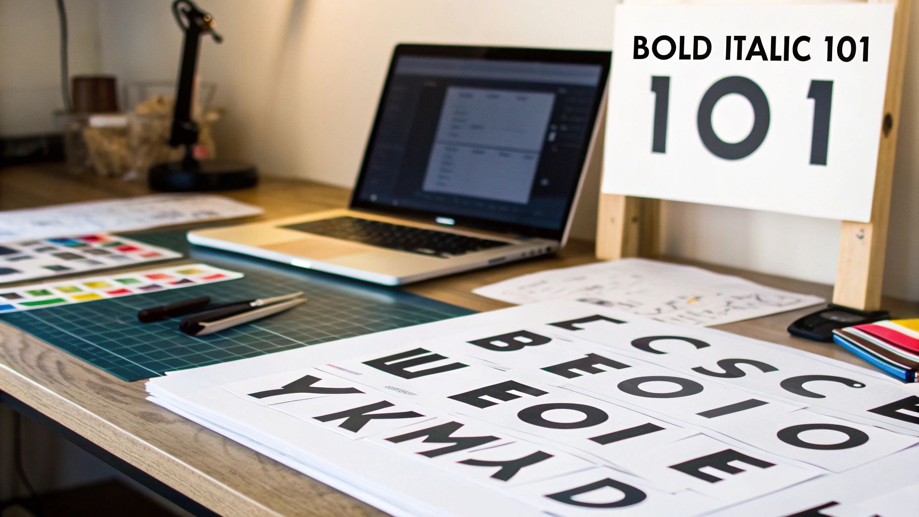
Bold and italic fonts are so much more than just a way to spice up your text. Think of them as fundamental tools for adding emphasis and creating a clear visual hierarchy. Bold text is designed to grab attention, giving words extra weight and making them stand out. Italics, on the other hand, offer a softer, more nuanced touch for highlighting specific words or phrases.
Getting a feel for their unique roles is the first step toward creating content that’s clear, effective, and looks truly professional. An AI font generator can even help you create custom styles that perfectly fit your needs.
The Foundations of Typographic Emphasis
Imagine you're in a conversation. Sometimes you raise your voice to make a really important point, and other times you might lean in and whisper a key detail. Bold and italic fonts do the exact same thing for your writing. They’re not just stylistic frills; they’re essential signals that guide your reader, telling them what’s important and how to interpret the information.
This whole idea of guiding the reader is what designers call visual hierarchy. Just like a map uses different colours and line thicknesses to show the difference between a motorway and a quiet country lane, typography uses styles like bold and italic to create a clear path of importance. A bold heading immediately tells you a new topic is starting, while an italicised word in a sentence hints at a shift in tone or a specific point to focus on.
The Psychological Impact of Bold Text
Bold fonts are the extroverts of typography—they’re direct, assertive, and impossible to ignore. The thicker strokes make them physically stand out from the surrounding text, immediately drawing the reader's eye. This visual weight translates directly into conceptual weight, signalling that this information is crucial.
It’s no surprise, then, that bold is the go-to choice for:
- Headings and Subheadings: They break up content and make it a breeze to scan.
- Key Terms: Highlighting important concepts the first time they pop up helps with comprehension.
- Calls to Action: Making buttons and links stand out is key to encouraging clicks.
The power of bold isn’t just some modern design fad. In the United Kingdom, typographic research has long shown its value in public communications where clarity is paramount. Studies consistently find that bold fonts create strong visual cues, making it much easier for people to spot important titles and keywords. You can learn more about this typographic research and its findings.
The Subtle Power of Italics
If bold text shouts, then italics lean in and whisper. Italic text offers a much more refined kind of emphasis. It’s often used to signal a change in tone or to set a piece of text apart without completely disrupting the visual flow of a paragraph.
You’ll typically see italics used for:
- Emphasising a specific word to add nuance.
- Indicating the titles of books, films, or publications.
- Representing a character's inner thoughts in creative writing.
Mastering both of these styles—and learning how to generate unique versions with an AI font generator—is foundational to communicating effectively in any medium.
The Story Behind Bold and Italic Typefaces
Every font style we use has a backstory. The bold italic fonts that feel so familiar today weren't just invented for a word processor; they're the result of centuries of typographic evolution, each born from a specific need and a flash of creative genius. Knowing where they came from gives us a much deeper appreciation for how to use them well.
Our journey starts not with bold, but with its more graceful cousin, italics. Picture early 16th-century Venice, a buzzing centre of Renaissance printing. A scholar and printer named Aldus Manutius had a problem: he wanted to create smaller, more portable books that were still affordable and easy on the eyes. His solution was brilliant. He commissioned a typeface that mimicked the flowing, slanted handwriting of Italian scholars.
This new style, which first appeared around 1500, wasn't meant for emphasis at all—it was designed to be the main text for entire books! This little innovation completely reshaped European printing and influenced British publishers for hundreds of years. You can dive deeper into the history of italic type and its Venetian roots on Wikipedia.
The Rise of Bold in the Industrial Age
If italics were born from scholarly elegance, bold fonts were a product of a much louder era: the Industrial Revolution. As cities boomed and commerce exploded in the 19th century, a new challenge emerged. Advertisers needed a way to make their messages shout from posters, flyers, and newspaper headlines in an increasingly cluttered world.
Typographers answered the call by creating typefaces with much thicker strokes, engineered for maximum impact and visibility from a distance. These early "fat faces" are the direct ancestors of the modern bold fonts we know and love. Their purpose was clear from day one: be assertive, command attention, and create a strong visual hierarchy.
From these very different beginnings, the two styles eventually found their way to each other. What started as separate tools—one for compact, flowing text and the other for loud, attention-grabbing headlines—became essential partners in modern communication.
Today, we pair them up without a second thought, but their histories still inform how we should use them. Whether you're crafting a unique look with an AI font generator or choosing a classic pairing, understanding their story helps you use bold italic fonts with more purpose and skill.
Choosing The Right Emphasis: Bold vs Italics
Figuring out whether to use bold or italics is a bit like choosing between a spotlight and a subtle nod. Both are used for emphasis, but they communicate in totally different ways. Getting it right isn't about following some dusty old rulebook; it’s about understanding what each style is built for and matching it to what you’re trying to say.
Think of bold text as your go-to for grabbing someone's attention instantly. Its heavier weight creates a powerful visual pop that the eye just can't skip over. This makes it perfect for things that need to be seen and understood in a flash, acting like little signposts for your reader.
When To Use Bold For Maximum Impact
Bold is assertive. It’s direct. It basically tells the reader, "Hey, this part is critical." Its main job is to create structure and pull out the most important bits of your content so no one misses them.
You’ll want to reach for bold when you're dealing with:
- Headings and Subheadings: These break up your text and make it easy for people to scan and find what they're looking for.
- Key Terms and Definitions: When you introduce a new concept, bolding it helps lock that term into the reader’s memory.
- Calls-to-Action (CTAs): A bold "Download Now" or "Sign Up Today" makes the button or link much more visible and encourages that all-important click.
- Important Warnings: For any crucial disclaimers or instructions, bold text makes sure the message lands and isn't accidentally overlooked.
This infographic lays out how these different styles work together to create a balanced design.
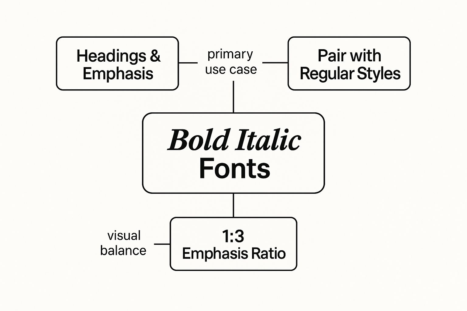
The real takeaway here is balance. Using bold italic fonts effectively means pairing them smartly with your regular text and not going overboard, which can just overwhelm the reader. An AI font generator can be a great tool for creating balanced font families that include multiple weights and styles.
When To Use Italics For Subtle Nuance
Italics, on the other hand, bring a quieter, more refined kind of emphasis. They suggest a little shift in tone or context without shouting about it. This gentle touch makes them perfect for moments that need a bit of finesse rather than a sledgehammer. An AI font generator can even help you create custom italic styles that perfectly capture the exact tone you're going for.
Consider using italics for situations like these:
- Subtle Emphasis: To stress a single word in a sentence, which can slightly alter the meaning. For example, "I think it's a good idea" puts the focus on a personal opinion.
- Titles of Works: It's standard practice for referencing books, films, podcasts, and articles, like Pride and Prejudice.
- Foreign Words: To set apart words that aren't native to the main language, such as déjà vu.
- Internal Monologue: In creative writing, italics are often the go-to for showing a character's thoughts.
Choosing the right emphasis isn’t just a design choice; it’s a communication strategy. Bold commands attention, while italics invite a closer look. Using each one for its intended purpose creates a clearer, more engaging experience for your audience.
To help you decide at a glance, here’s a quick comparison of when to use each style.
Bold vs Italic: A Quick Reference Guide
This table provides a clear comparison of bold and italic font styles, outlining their primary functions, visual impact, and best use cases to help you choose the right emphasis for your content.
| Attribute |
Bold |
Italic |
| Primary Function |
To grab attention and create structure |
To add nuance and signal a shift in tone |
| Visual Impact |
High contrast, assertive, and strong |
Low contrast, subtle, and elegant |
| Best For |
Headings, keywords, CTAs, warnings |
Titles, foreign words, specific word stress |
| Psychological Cue |
"This is important, pay attention!" |
"Read this a little differently." |
Mastering the difference between these two powerhouse styles allows you to guide your reader with real precision.
If you're keen to explore other typographic styles, you can learn more about how to use a small caps font in our detailed guide. By mastering the interplay between bold, italics, and other styles, you can elevate your text from simply being readable to being genuinely impactful.
Using the Power of Combined Bold Italics
Applying bold and italics together is the typographic equivalent of turning the volume up to eleven. It's the most intense level of emphasis you can get, a kind of digital highlighter pen that’s impossible to miss. But like any powerful tool, you should reach for it sparingly. Using bold italic fonts is all about creating maximum impact, but only in very specific situations.

This combo is really reserved for those moments when you need to layer emphasis on top of another emphasis. Its main—and maybe only—truly effective use is to stress a single word or a short phrase inside a passage that's already in italics. This keeps it from becoming visually overwhelming.
Think about a quote set entirely in italics. If you want to draw the reader's eye to the most critical part of that quote, bold italics becomes your go-to. It’s your way of saying, “Hey, pay extra attention to this specific part.”
The Principle of Less Is More
The golden rule for using combined bold italics is simple: restraint. Overdo it, and you’ll create a mess of visual noise that makes your text a chore to read. When everything is shouting for attention, nothing actually stands out.
Imagine a page where every other sentence is bold and italicised. The intended emphasis gets completely lost, leaving the reader with a cluttered and confusing mess. Its power comes directly from its scarcity.
By keeping bold italics for only the most crucial moments, you guarantee it lands with its full impact. When it does appear, it should feel like a deliberate, important signal to the reader—not just another decorative flourish.
To really nail this advanced technique, you have to treat it with care. An AI font generator can help you create custom bold italic fonts that are designed to stay clean and legible even when combined, giving you much more control over how they look on the page.
Correct vs Incorrect Usage Examples
To see this principle in action, let's look at how to get it right.
Always remember, clarity is the goal. Use bold italics to add a very precise layer of meaning, not to just make things louder. This careful approach is what separates professional typography from amateur design, ensuring every stylistic choice you make has a clear purpose.
Creating Custom Bold Italic Fonts With AI
Off-the-shelf font libraries are a brilliant place to start, but for brands and creators who want to carve out a truly unique visual voice, customisation is the next frontier. This is exactly where the AI Font Generator shines, taking you beyond pre-made options and into a playground of typographic creation. These tools let you design your very own bold italic fonts from the ground up.
Instead of endlessly scrolling through existing typefaces, you get to be the creative director. The magic begins when you provide a descriptive prompt—think of it as the creative brief for the AI. This simple instruction is the seed from which your custom font will grow.
How AI Font Generation Works
Picture an AI font generator as a master typographer who can work at lightning speed. You bring the inspiration, and it handles all the complex design heavy lifting. The whole process really boils down to defining the characteristics you want your font to have.
Your creative journey will usually look something like this:
- Writing a Descriptive Prompt: This is where you give the font its personality. Are you after "a bold, futuristic sans-serif with a sharp 15-degree italic slant"? Or maybe "an elegant, handwritten script with heavy, flowing bold italics"? The more detail you pack in, the closer the AI gets to your vision.
- Defining Key Parameters: You can get specific with the typographic details that matter. This includes setting the font weight (how bold you want it), the slant angle for the italics, and any other unique stylistic quirks you want to see.
- Generating and Refining: The AI takes your instructions and churns out a range of font options. From there, you can browse the results, pick your favourites, and even fine-tune them by tweaking your prompt or parameters until you land on the perfect custom font.
This approach completely flips the design process on its head. Instead of hunting for a font that fits your brand, you can now use an AI font generator to create a font that is born from your brand's identity, ensuring a perfect match every single time.
Crafting Effective AI Prompts
The quality of your final font is directly tied to the quality of your prompt. A vague prompt will give you generic results, but a specific, evocative one will produce something truly special. For anyone using an AI font generator to generate unique typefaces, getting good at this new form of communication is key. You can dive deeper into mastering prompt engineering to really sharpen this valuable skill.
Here are a few tips to get you writing better prompts:
- Be Specific About Style: Use descriptive words like "geometric," "organic," "vintage," or "minimalist."
- Mention Weight and Slant: Clearly state that you want bold italic fonts, and feel free to specify the degree of each if you have a preference.
- Draw Inspiration: Reference artistic movements or styles. For example, our guide on fonts for art can give you some great ideas for descriptive language to use in your prompts.
By using an AI Font Generator, you unlock the power to create a typographic style that is exclusively yours. It's the secret to giving your projects a memorable and consistent look that truly stands out from the crowd.
Best Practices for Using Fonts in the UK
When you’re designing for a UK audience, your font choices matter more than you might think. Getting them right helps your content feel credible and professional. British design has a long-standing appreciation for clarity and tradition, and this definitely shines through in how fonts are used across print and digital media.
Look at the UK publishing world, and you’ll see a clear divide. Classic serif fonts like Times New Roman and Garamond still rule the roost in print, accounting for over 40% of fonts in books, where bold italic fonts are the go-to for emphasis. But hop over to the digital space, and it's a different story. Guided by GOV.UK's accessibility standards, sans-serifs like Arial are king, purely because they’re easier to read on a screen.
Prioritising Accessibility and Clarity
In UK digital design, accessibility isn't just a buzzword; it's a core principle. The GOV.UK style guide is the gold standard here, and it’s all about making sure everyone can understand the content. It recommends using bold text sparingly—just enough to highlight key info without shouting at the reader.
It also advises against long blocks of italics because they can be a real headache for users with dyslexia or visual impairments.
When designing for a UK audience, the goal is always legibility over elaborate styling. Every font choice, from the base typeface to the application of bold or italic styles, should serve the reader first.
This focus on clarity ensures your message lands with the widest possible audience. And these guidelines aren't just for government websites; they’re fantastic principles for any organisation that wants to communicate effectively.
So, how do you stay on brand while playing by the rules? This is where an AI font generator comes in handy. It lets you create custom bold italic fonts that are both distinctive and designed from the ground up with legibility in mind.
Balancing Brand Identity with Convention
Following UK conventions doesn't mean your brand’s personality has to take a backseat. It's all about finding that sweet spot between established norms and your unique visual identity. Nailing this balance ensures your content connects with local audiences while still feeling authentically you.
While this guide is all about fonts, it's just one piece of the puzzle. You might want to explore broader website design best practices to get a more complete picture. And don't forget the legal stuff! Check out our guide on font licensing for commercial use to make sure your custom creations are good to go.
Common Questions About Bold Italic Fonts
As you start playing around with bold and italic styles, you'll probably run into a few common questions. Nailing down the answers will help you sidestep some classic typography traps and get the most out of your fonts—whether you're using a standard typeface or cooking up something totally new with an AI font generator.
One of the biggest questions is whether you can just click the 'B' or 'I' button in your software to make any font bold or italic. Sure, most word processors let you do this, but for any kind of professional work, it's a huge no-no. This trick creates what’s known as a "faux" or fake style, where the software just mechanically thickens or slants the original letters.
More often than not, this distorts the characters, making them look clunky and hard to read. True bold and italic fonts are actually designed from scratch as separate, distinct files by a typographer. They’re crafted to be perfectly balanced and clear. Whenever you can, always use the dedicated font file. An AI font generator is designed to create these true, professionally crafted styles, not faux ones.
Technical and Practical Considerations
Another point of confusion is the difference between italic and oblique fonts. A true italic is a completely new design, often with curvy, cursive-inspired letterforms that have a natural flow. An oblique font, on the other hand, is a lot like a faux italic—it’s just a slanted version of the regular font with no real changes to the shapes of the characters themselves. True italics almost always look more polished and are easier on the eyes.
Accessibility is also a massive consideration. While bold text can actually boost readability by adding contrast, italics can be a real headache for readers with dyslexia or other visual impairments.
The slanted nature of italic characters can make them harder to decipher, so it's best to use them for short phrases and avoid them for long blocks of text. This ensures your message is clear and accessible to the widest possible audience.
Finally, can using bold italic fonts give you a little SEO boost? The answer is a subtle yes. Using the <strong> (bold) and <em> (italic) tags correctly helps search engines figure out which parts of your content are most important, giving them hints about your main topics.
Ready to create a font that perfectly captures your brand's voice? The AI Font Generator makes it easy to design unique, professional-quality bold and italic styles in seconds. Start creating for free today at https://aifontgenerator.com.