A small caps font is a clever typographic style where letters that look like capitals are designed to be a similar height and weight to lowercase letters. This simple trick creates a clean, harmonious line of text that adds emphasis without the jarring feel of a full uppercase shout. It's a seriously powerful tool for any designer looking to add a touch of class.
What Are Small Caps and Why Do They Matter
Ever wanted to make a word stand out without screaming at your reader? We’ve all been there. ALL CAPS can feel aggressive, while bold or italics might not hit the right note. This is exactly where small caps shine. Think of them as the firm, clear voice in your design—assertive, but never overwhelming.
This subtle distinction is why designers absolutely love them for creating clean, professional, and super-readable layouts. It’s a brilliant way to guide the reader’s eye and build a clear visual hierarchy. But here’s the catch: not all small caps are created equal, and knowing the difference is the secret to getting it right.
The Critical Difference: True vs Faux Small Caps
The single most important thing to get your head around is the difference between true small caps and faux small caps. This isn't just nerdy design talk; it’s fundamental to achieving a polished, professional look.
- True Small Caps: These are the real deal. A typographer has painstakingly designed them as part of a complete font family. Every letterform is drawn from scratch to perfectly match the stroke weight, proportions, and overall colour of the lowercase letters. The result? A seamless, balanced, and beautiful line of text.
- Faux Small Caps: This is the cheap knock-off version automatically generated by software. The program just takes the standard capital letters and shrinks them down. This lazy shortcut creates thin, spindly characters that look weak and totally out of place, completely wrecking the visual rhythm of your text.
A well-designed typeface with true small caps ensures every character feels like it belongs to the same family. It’s all about maintaining that visual consistency.
Using faux small caps is a classic rookie mistake that can instantly undermine an otherwise great design. The characters look too light and cramped, creating an uneven texture that screams a lack of typographic skill. Learning to spot this difference is the first step toward mastering this sophisticated tool.
On that note, modern tools like an ai font generator are becoming indispensable for creating custom typefaces that include perfectly balanced, true small caps from the get-go. This ensures every element of your typography is purpose-built and cohesive right from the start.
Tracing the Typographical Roots of Small Caps

To really get what makes small caps so elegant, we have to go back in time. Picture the buzzing print shops of 15th-century Venice, the epicentre of innovation during the Italian Renaissance. This is where the legendary printer Aldus Manutius first cooked up this clever typographic trick. His motivation wasn't just about style; it was a brilliant fix for a persistent design headache.
Manutius was looking for a way to highlight names or the first few words of a paragraph without the loud interruption of full-sized capital letters. His solution? He created a custom set of smaller capitals, meticulously cast from metal, designed to blend in seamlessly with the lowercase text around them. It was an innovation that brought a whole new level of polish and visual harmony to the printed page.
From Metal Type to Digital Design
For hundreds of years, the small caps font was a specialist tool, mostly found in the hands of traditional printers working with metal type. Making them was a serious craft, a painstaking process saved for high-end book printing where beauty and readability were everything. This was the domain of true typesetters, a skill that required an artist’s eye and an engineer’s precision.
As printing technology moved forward, small caps came along for the ride. They became a signature of fine typography, popping up in everything from legal documents to classic literature to signal a sense of authority and timeless class. These historical roots are exactly why small caps still feel so traditional and scholarly today. If you want to dig deeper into how these styles came to be, exploring the history of old style typefaces is a great place to start.
The switch to digital typography in the late 20th century gave small caps a massive comeback. Suddenly, what was once a niche tool for printers became available to a huge audience of designers and creatives. An ai font generator is the latest evolution in this timeline, making custom font creation accessible to all.
For over 500 years, the core job of small caps hasn't changed: provide emphasis with elegance, without the visual shouting of full caps.
This digital rebirth transformed them from a functional printer's tool into a flexible, creative element in every designer's toolkit. The principles Manutius laid down—balance, harmony, and subtle emphasis—found a new home on screens and in modern print.
The Modern Role of a Classic Font Style
Today, the legacy of those early printers is alive and well in modern design software. In fact, the inclusion of true, properly designed small caps is still a hallmark of a professional typeface, separating the good from the great. They're no longer just for the first line of a book chapter; you'll now see them used creatively in logos, headlines, and even user interfaces.
This rich history is what gives them their staying power. When you use a small caps font, you’re not just picking a style; you’re tapping into a long, proud tradition of typographic excellence. It's this link to the past that gives them their unique character—a perfect mix of classic authority and modern-day clarity. And the evolution isn't over. Tools like an ai font generator are now carrying this centuries-old tradition into a new era, making it possible to create custom fonts with perfectly balanced small caps built right in.
How to Use Small Caps for Maximum Impact

Knowing what a small caps font is is one thing, but mastering when to use it is where the real design magic happens. Using them well is a game of strategic subtlety, adding a layer of polish that takes your work from good to genuinely great. They’re perfect for adding emphasis and structure without the shouting of bold type or the lean of italics.
Think of small caps as a precision tool. They shine in situations where full uppercase letters would feel too aggressive, yet regular lowercase might just get lost in the noise. Nailing this balance is the key to creating a sophisticated and clean visual hierarchy. For custom projects, an ai font generator can help create a font where this balance is perfectly tuned.
Establishing Hierarchy with Titles and Subheadings
One of the best uses for small caps is in titles, subheadings, and running headers. They create a distinct typographic level that’s less shouty than a main headline but stands out more than the body text.
For instance, in a book or a detailed report, using small caps for chapter titles or section headers brings an air of academic refinement. It guides the reader’s eye smoothly through the content, signalling a new section without a jarring shift in tone. This builds a calm, organised reading experience from start to finish.
The goal is to create visual texture and guide the reader's focus gently. Small caps excel at adding emphasis while maintaining the overall colour and rhythm of the text block.
This technique is especially effective for running headers at the top of a page. A header set in small caps feels less intrusive than one in title case, keeping it from distracting the reader while still offering clear navigation.
Adding Distinction to Acronyms and Initialisms
Acronyms like NASA or UNESCO can really mess with the visual flow of a paragraph when set in full caps. They stand out like a sore thumb, interrupting the rhythm and creating awkward spacing. This is exactly where small caps offer an elegant fix.
By setting these acronyms in a small caps font, you let them blend in harmoniously with the surrounding lowercase letters. They’re still distinct and easy to spot, but they no longer scream for attention. The result is a page that feels more cohesive and is just plain easier to read.
- Before: The launch by NASA was a success. (The acronym feels loud and clunky).
- After: The launch by Nᴀꜱᴀ was a success. (The acronym is emphasised but beautifully integrated).
This simple switch makes a world of difference, especially in technical, academic, or professional documents where acronyms are everywhere.
Creative Applications in Branding and Design
Beyond the functional stuff, small caps are a fantastic stylistic tool in branding. They can give a logotype or tagline a sense of heritage, stability, and premium quality. It’s no surprise that many luxury brands and law firms use them to convey authority and timelessness.
They also work brilliantly for name attributions, like crediting an author under an article title or citing a source. To make sure your typographic choices perfectly match your overall visual identity, you might want to explore professional brand design services.
Whether for print or digital, the subtle authority of small caps helps build a strong, credible brand presence. And with modern tools, even an ai font generator can be used to create a unique font family that includes beautifully crafted small caps for a completely bespoke branding project.
Small Caps Usage Cheat Sheet
To make things even clearer, here’s a quick cheat sheet to help you decide when and where to deploy small caps for the best effect.
| Use Case |
Recommended |
Use With Caution |
Avoid |
| Titles & Subheadings |
✅ Excellent for creating a subtle hierarchy level. |
In very short, punchy headlines where impact is key. |
For the main, top-level headline of a page. |
| Running Headers |
✅ Perfect. It's informative without being distracting. |
When the header text is very long or complex. |
In headers that need to grab immediate attention. |
| Acronyms & Initialisms |
✅ The ideal solution for blending them into text. |
If the acronym is the main subject (e.g., in a logo). |
For single-letter acronyms (e.g., "A" for "Apple"). |
| Logos & Branding |
✅ Great for conveying heritage, luxury, and authority. |
For brands aiming for a playful or casual vibe. |
When maximum legibility from a distance is required. |
| Body Text |
❌ Never. It severely damages readability. |
A single emphasised word, but italics are better. |
For entire paragraphs or long sentences. |
| Navigation & UI |
✅ Can work well for secondary menu items or labels. |
For primary call-to-action buttons. |
For crucial interface elements requiring high scan-ability. |
This table isn't a set of hard rules but a guide to help you develop your typographic intuition. The versatility of small caps makes them an invaluable asset in any designer's toolkit, ready to be used for both clarity and creative flair.
Common Small Caps Mistakes to Avoid
Here are some common mistakes people make with small caps, and how you can sidestep them.
Using a small caps font can give your design a subtle, sophisticated edge, but it's easy to get it wrong. A few common missteps can mess up the visual flow and, even worse, make your text a pain to read. Think of small caps as a powerful tool that needs a delicate touch.
The good news? These slip-ups are easy to dodge once you know what to look for. By avoiding these classic blunders, you can use small caps with the confidence of a seasoned typographer, making sure your designs always look polished and deliberate.
The Cardinal Sin: Faux Small Caps
This is the big one. The single most critical mistake is using faux small caps. We touched on this earlier, but it’s worth repeating: these aren't real, purpose-designed characters. They're just standard capital letters that your software has shrunk down on the fly. This shortcut creates letters that look thin, weak, and spindly—an amateur move that screams "I faked this."
True small caps are drawn from scratch to match the weight and texture of their lowercase pals. The result is a balanced, harmonious line of text that feels intentional. Faux small caps completely wreck this balance, looking like a clumsy afterthought that can instantly cheapen your entire design.
The rule is simple: if your font doesn't have a true small caps set, don't try to force it. Just find another font or use a different method of emphasis, like italics or a slight colour shift.
Overuse Kills Readability
Another all-too-common error is plastering small caps over large chunks of text. They work brilliantly for highlighting a few words, a title, or an acronym, but setting whole sentences or paragraphs in small caps is a recipe for disaster. Why? Because the uniform height of the characters gets rid of the ascenders (the tall bits on 'h' or 'd') and descenders (the dangly bits on 'p' or 'g').
Our brains rely on those distinct shapes as signposts to recognise words quickly. When they're gone, the reader is forced to slow down and process each letter one by one, which is exhausting. Long passages of text need that familiar up-and-down rhythm of lowercase letters to be read effortlessly.
- Do: Use small caps for short titles, running headers, or acronyms like Nᴀᴛᴏ.
- Don't: Set your entire introduction or a long quote in small caps.
Think of small caps like a potent spice. A little pinch adds flavour and character, but dump in too much and you'll ruin the whole dish.
Forgetting to Adjust Tracking
Whenever you set text in any kind of capitals—and that includes small caps—the spacing between the letters often needs a little love. The default spacing, known as kerning, is usually optimised for lowercase letters. Text set in all caps almost always looks better with a bit more breathing room between the letters. This is called tracking.
Small caps are no different. Without a slight increase in tracking, they can look cramped and dense. Adding just a tiny bit of extra space between each letter prevents them from visually smudging together, making the text feel more open and easier on the eye. Most design software lets you make very precise tracking adjustments, often in tiny increments of 1/1000 of an em. A small tweak of +5 to +15 can make a world of difference.
Ultimately, mastering the small caps font is all about getting the details right. For designers who want total control, using an ai font generator is a fantastic way to create a custom typeface with a perfectly weighted and spaced set of true small caps built right in from the start. That way, you know every element is designed to work together perfectly.
Creating Your Own Small Caps with an AI Font Generator
Hunting for the perfect professional typeface that already includes small caps is always a solid move. But what if you could skip the search and just… create your own? Not long ago, that idea was pure fantasy unless you were a seasoned typographer with months to spare. Today, an AI font generator puts that power right in your hands, letting you build a completely unique typeface from scratch, complete with its own perfectly balanced set of small caps.
This is a massive shift. We're moving from just using fonts to actively designing them. Instead of trying to find a font that kinda-sorta fits your vision, you can now generate one that’s made-to-measure for your brand or project. The whole process is faster and way more accessible, opening up the world of custom typography to pretty much everyone.
How Generative AI Is Changing Typography
So how does it work? An ai font generator takes a few of your initial design ideas—maybe just a handful of "seed" letters you've sketched out—and cleverly builds an entire character set from them. It looks at the shapes, the stroke weights, and all the little stylistic quirks of your input and produces a cohesive font family that feels unified.
This is a game-changer when you need a small caps font. Rather than you having to manually draw every single smaller capital letter and obsess over getting them consistent, the AI can generate them for you based on the rules already established in your primary character set. It does the heavy lifting, automatically figuring out the right height, weight, and spacing to make your small caps look harmonious.
The real magic of using AI here is speed and consistency. The generator can spit out a full set of glyphs, including true small caps, in a tiny fraction of the time it would take to design them by hand. And it ensures every single character feels like it belongs to the same family.
This basically democratises font design. What once took years of training and pricey software can now be kicked off with a few clicks. It makes custom typography a real, practical option for designers, marketers, and creators at any skill level.
A Step-by-Step Guide to Creating Your Font
Generating your own font might sound intimidating, but modern tools have made the workflow surprisingly simple. The main idea is to give the AI some creative direction and let it handle the repetitive, technical parts of producing the final typeface.
This infographic breaks down the thinking process for using small caps in a project, from the initial choice to final testing.
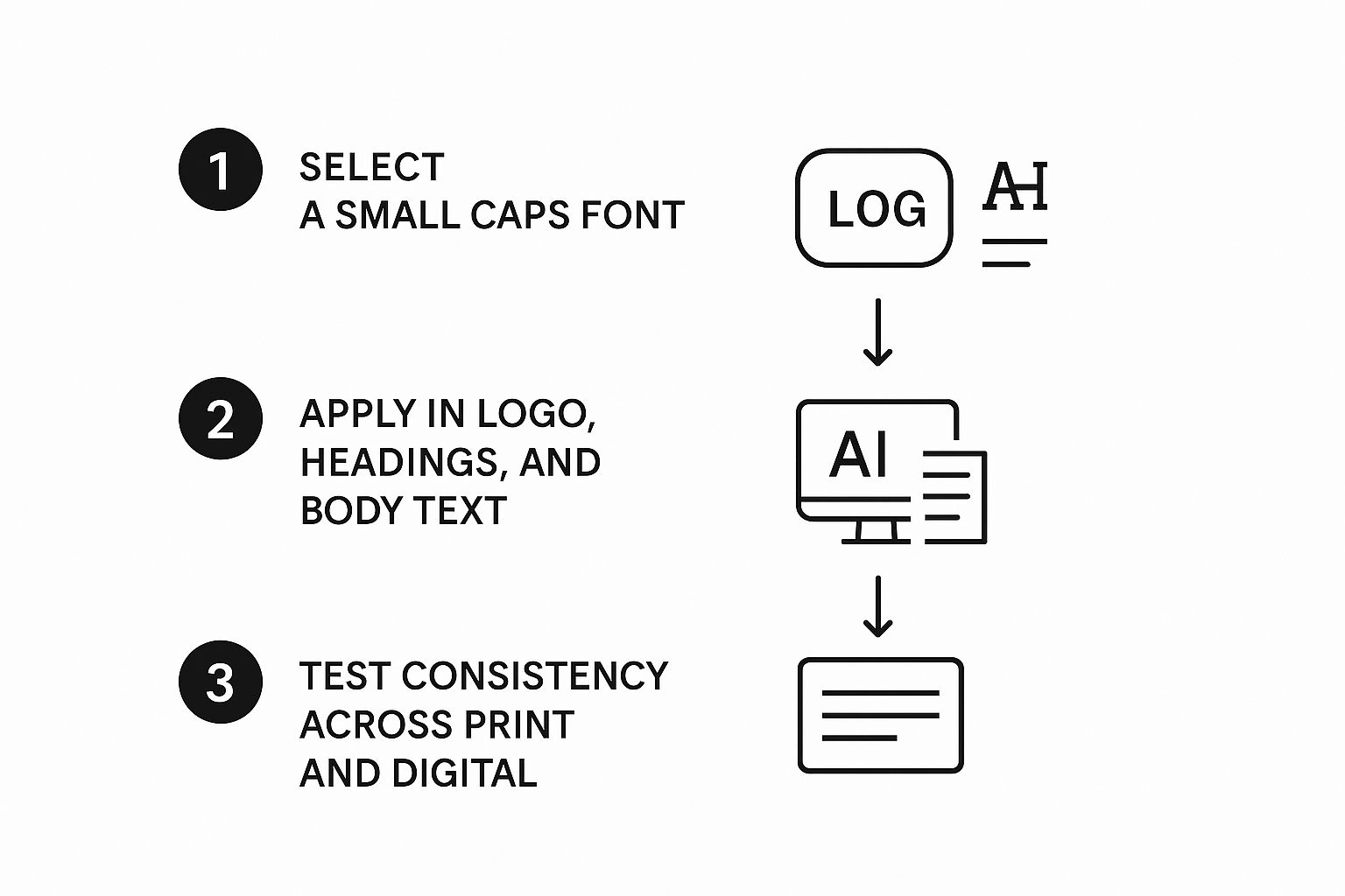
As you can see, a successful result comes from a methodical approach, ensuring everything feels consistent across all your brand touchpoints.
The creation process itself usually follows a few key stages:
- Define Your Core Letters: You start by drawing or uploading a few key characters that capture the soul of your font. Letters like 'a', 'n', 'H', and 'O' are great choices because they contain all the essential curves, straight lines, and internal spaces that define a typeface.
- Set the AI Parameters: Next, you’ll tell the ai font generator what you want. You can specify which character sets to include (like punctuation, numbers, and multilingual support) and, crucially, instruct it to generate a true small caps variant. You might also be able to tweak parameters for weight, width, and overall style.
- Generate and Iterate: With your instructions locked in, the AI gets to work and produces an initial draft of your font. This is your chance to review the output, spot any characters that look a bit off, and give feedback for another round of generation. It's a creative back-and-forth.
Polishing the AI's Output
While AI is incredibly good, the most stunning results usually come from a combination of machine generation and a human touch. The initial output from the ai font generator might be 95% perfect, but a designer’s eye is essential for that last little bit of polish.
Here are a few things to look for when refining your custom small caps font:
- Check Stroke Weight Consistency: Look closely to make sure the thickness of the small caps' strokes perfectly matches the visual weight of the lowercase letters. Sometimes the AI can make them a tiny fraction too light or too heavy.
- Adjust Proportions and Width: Compare the width of letters like 'm' and 'w' in small caps to their uppercase cousins. They should feel related, but optically balanced for their smaller size.
- Fine-Tune the Spacing: As we've covered, small caps often need a little more tracking (letter-spacing) than lowercase text. Play around with small adjustments to give your characters the breathing room they need to look sharp and legible.
This human-AI collaboration ensures your final font is not just unique but also professionally polished and ready for anything you throw at it. To start exploring what’s possible, you can learn more about how an AI Font Generator works and begin creating your own custom typography today. The end result is a one-of-a-kind asset that will make your designs truly stand out.
Finding Professional Fonts with True Small Caps
While cooking up a custom typeface with an ai font generator gives you ultimate creative freedom, sometimes you just need a solid, professional font that’s ready to roll. The great news is, tons of high-quality typefaces already come with a full set of true small caps baked right in. The trick is knowing where to find them.
Diving into the massive world of font libraries can feel like a bit much, but a few tell-tale signs will point you in the right direction. Once you know what to look for, you can start building a collection of versatile, pro-level fonts that will serve you well for years to come.
Navigating Font Libraries and Marketplaces
Big-name platforms like Adobe Fonts and Google Fonts are fantastic places to start your search. These libraries are well-curated and usually give you the full scoop on what each font family includes. As you browse, keep an eye out for specific clues that a true small caps font set is part of the package.
Often, the most obvious hint is right there in the font family’s name. Designers frequently label these special variants with suffixes like ‘SC’ or simply ‘Small Caps’. You might see a font listed as "Trajan Pro," with a separate style in its family called "Trajan Pro SC."
The presence of a dedicated small caps style is a strong indicator of a well-crafted, professional typeface. It shows the designer invested the time to create a complete and versatile typographic system.
Another place to check is the font’s glyphs panel in whatever design software you’re using. A quick scroll through all the available characters will tell you instantly if true small caps are included. They’ll show up as their own unique set of letterforms, completely separate from the standard uppercase and lowercase letters.
Curated List of Fonts with Excellent Small Caps
To give you a head start, I’ve pulled together a list of celebrated fonts known for their beautiful, designer-crafted small caps. These are trusted workhorses in the design world and make fantastic additions to any toolkit. Just remember, before you use any font in a project, it's always smart to double-check its usage rights. You can get up to speed by reading our guide on font licensing for commercial use.
Serif Fonts:
- Minion Pro: An Adobe original, this typeface is a powerhouse known for its incredible readability and elegant, perfectly balanced small caps.
- Garamond Premier Pro: Another classic from Adobe, its small caps are incredibly refined, perfect for creating a sophisticated, traditional feel.
- Trajan: This font is famous for being composed almost entirely of capital letterforms, making its primary set a form of small caps. It just radiates history and grandeur.
Sans-Serif Fonts:
- Gotham: A modern favourite, Gotham’s massive family includes beautifully drawn small caps that feel clean, confident, and authoritative.
- Proxima Nova: A superstar on the web for its clarity, this font family has a robust set of true small caps that are perfect for UI elements and subheadings.
- Avenir Next: Known for its geometric precision and warmth, Avenir Next’s small caps are clean, legible, and super versatile for all sorts of design projects.
Having a few of these reliable options on hand means you’re always ready to add that extra touch of typographic polish to your work.
Got Questions About Small Caps? We’ve Got Answers.
Alright, let's wrap things up by tackling some of the questions that pop up most often when designers and writers start playing with small caps. Think of this as your quick-fire guide to using them with confidence.
Do Small Caps Make Text Harder to Read?
It really comes down to how you use them. For short bits of text—think titles, acronyms, or running headers—small caps are fantastic. They add a touch of class and emphasis without shouting at your reader.
But using them for long sentences or, heaven forbid, entire paragraphs? That's a classic design mistake. Our brains rely on the unique shapes of lowercase letters to read quickly, and when everything is a uniform height, that recognition process grinds to a halt. Keep it short and sweet.
Can I Actually Use Small Caps on a Website?
Absolutely! Small caps can look incredibly sharp on the web, especially for UI elements like navigation links, button labels, or metadata. They bring a clean, organised feel to an interface.
The trick is to make sure you’re using a web font that has a proper, "true" small caps set built-in. You can call it up with a simple line of CSS: font-variant: small-caps;.
Just a friendly reminder: always test your web typography on different screens. What looks amazing on a big desktop monitor might feel cramped and illegible on a small phone.
Do I Need Fancy Software to Make Small Caps?
Not really special software, but you definitely need a font that was designed with a true small caps character set from the get-go. Most professional design tools like Adobe InDesign or Illustrator know exactly what to do with these. You can usually find the option tucked away in their typography or OpenType features panels.
Is an AI Font Generator a Good Way to Get Small Caps?
Yes, an AI font generator is a brilliant tool for this. Instead of hoping a font you like has small caps, you can create a completely bespoke typeface where perfectly balanced, true small caps are part of the design from the very beginning.
This process ensures total consistency in style, weight, and spacing across the entire font family. It’s a fast track to getting a unique and professional result without needing to be a seasoned typographer.
Ready to create a font that's all yours, complete with a professional set of small caps? The AI Font Generator makes it incredibly simple. Generate stunning, custom font images in seconds for free. Start designing your perfect font now at aifontgenerator.com.