Fed up with the same old fonts you see everywhere? Finding the right free online font creator means you can finally design a unique typeface that perfectly captures your brand's voice, and you can often do it in just a few minutes. Tools like an AI font generator are making this whole process easier than ever, putting pro-level design tools in everyone's hands.
Crafting Unique Fonts Without the Cost

The days when creating custom fonts was reserved for seasoned typographers with seriously expensive software are long gone. Now, a whole host of online platforms empower designers, marketers, and creators to build bespoke typography for any project imaginable.
Whether you're working on a website, new product packaging, or just some social media graphics, a one-of-a-kind font makes your brand instantly recognisable.
This guide is your ticket into this exciting world. We'll dive into how these accessible tools—especially the powerful rise of the AI font generator—are making custom typography a real possibility for everyone.
The Growing Demand for Custom Typography
The move towards custom fonts is part of a much bigger trend in digital design. Brands are always on the lookout for fresh ways to stand out in a ridiculously crowded market, and unique typography is a seriously powerful way to do it. This isn't just a global thing; it's picked up massive momentum right here in the UK.
The surge in free online font creators, including the popular AI font generator, goes hand-in-hand with the demand for personalised, easy-to-use design tools. In fact, over 60% of UK graphic design professionals have used at least one free online font creator in their workflow, a huge jump from just 25% back in 2015. You can find more insights on this design trend over on Reeds.
Key Features in Top Free Font Creators
When you're choosing a tool, knowing what to look for can save you a ton of time. This table breaks down some of the most important features to help you pick the right free online font creator or AI font generator for what you need to do.
| Feature |
What It Means For You |
Commonly Found In |
| AI Generation |
Create new font styles from text prompts, perfect for brainstorming unique concepts. |
Calligraphr, Fontjoy, Fontself Maker |
| Vector Editing |
Fine-tune letter shapes with precision control over curves and points, like in pro software. |
Glypher Studio, BirdFont |
| Handwriting Import |
Turn your own handwriting into a digital font for a truly personal touch. |
Calligraphr, YourFonts |
| Kerning & Spacing |
Adjust the space between letters for a polished, professional look. |
FontForge, BirdFont, Glypher Studio |
| Export Formats |
Save your font as a standard file (OTF, TTF) that works across all your design applications. |
Most reputable font creators |
Ultimately, the best tool is the one that fits your project's specific needs—whether that's quickly generating ideas with AI or getting deep into the weeds with vector controls.
What Can You Achieve with These Tools?
So, what does all this actually mean for your projects? When you use a free online font creator or AI font generator, you get direct control over your brand's visual identity. You can finally step away from the standard library of fonts that millions of others are using and build a look that's all your own.
Here’s a quick look at what's possible:
- Develop a Brand-Specific Font: Craft a typeface that echoes the curves in your logo or matches your brand’s sleek, minimalist style.
- Digitise Your Handwriting: Create a genuinely personal font by turning your own script into a usable digital format for signatures or informal branding.
- Generate AI-Powered Designs: Use an AI font generator to dream up completely new and unexpected letterforms from simple text prompts, opening up creative avenues you hadn't even considered.
By stepping away from common fonts like Arial or Times New Roman, you're not just choosing a different look; you're building a memorable and cohesive brand experience from the ground up.
This guide will walk you through the entire process, from picking the right tool for the job to exporting a polished final font that’s ready for any application you can throw at it.
Choosing the Right Font Creation Tool

Not all font creators are cut from the same cloth. Picking the right one is the very first step to getting a design you’re actually proud of. Your project’s end goal should be the compass that guides your choice, as each tool offers a completely different path to creating type. Finding the perfect free online font creator, such as an AI font generator, really just means matching your vision with the platform’s strengths.
This all starts with understanding the main flavours of tools out there. From modular builders that feel like playing with digital LEGOs to platforms that can turn your messy handwriting into a usable font, the options are surprisingly deep. Making the right call now will save you a world of headaches later on.
Modular Font Builders
Ever thought about building a font by piecing together pre-made geometric shapes? That’s the magic behind modular builders like FontStruct. These tools are your best friend for crafting pixelated, retro, or highly structured fonts that have a cool, blocky feel.
Think of it as construction, but with digital bricks. You combine simple elements—squares, circles, lines—to build each letter from the ground up. It’s an incredibly intuitive process and perfect for anyone aiming for that nostalgic 8-bit video game aesthetic or a bold, architectural typeface.
Handwriting and Calligraphy Digitizers
For a look that's genuinely yours, nothing comes close to a font made from your own handwriting. This is exactly what platforms like Calligraphr were made for. You just print out a template, fill in the boxes with your letters or drawings, and then snap a photo or scan the sheet to upload it.
The software takes over, tracing your script and turning it into a fully functional font file. This is a brilliant route for artists who want a signature font for their work, wedding stationers designing custom invites, or really anyone who wants their digital text to feel a bit more human.
The real power of digitising your script is connection. A handwritten font carries a warmth and personality that standard typefaces just can't touch, making your message feel incredibly direct and personal.
The Power of AI Font Generators
Now for the really exciting stuff: the AI font generator. These are the tools that are completely changing the game, using machine learning to dream up entirely new typefaces from scratch. Instead of building letters piece by piece, you guide the AI with simple text prompts or visual style cues.
You could, for instance, ask an AI for "a delicate, Art Nouveau-inspired script with subtle floral elements" and watch it generate a complete character set that fits the bill. This approach is incredible for brainstorming unique concepts that you might never have stumbled upon otherwise.
An AI font generator is your go-to when you need:
- Rapid Idea Generation: Quickly test-drive dozens of different styles without sinking hours into manual design work.
- Unique Conceptual Designs: Create fonts that mash up different styles in surprising ways for a look that’s truly original.
- Inspiration for a Project: Use what the AI gives you as a launchpad, then take the generated font into a traditional editor for fine-tuning.
By getting to grips with these three core types—modular, handwriting, and AI-driven—you can confidently pick a free online font creator that aligns with your vision and gives your project the strongest possible start.
Bringing Your Font Idea to Life With an AI Generator
Alright, this is where the magic happens. Moving from an idea to a real, tangible typeface is the most exciting part, and with an AI font generator, it's less about technical wizardry and more about articulating your creative vision.
Think of yourself as a director and the AI as your incredibly talented, slightly literal artist. It's ready to bring your ideas to life, but it needs clear instructions. Your main tool for this is the text prompt—a simple phrase or sentence describing the font you've got in your head.
How to Write Prompts That Actually Work
The quality of your font is directly tied to the quality of your prompt. If you’re vague, you’ll get vague, generic results. Specific, descriptive prompts are what unlock the AI's real creative power. So, instead of asking for a "cool font," you need to get a bit more evocative.
For example, a prompt like "bold, futuristic sans-serif with sharp angles and a clean, minimalist feel" gives the AI a ton to work with. It clearly defines the style (bold, sans-serif), the vibe (futuristic), and specific design cues (sharp angles, minimalist). That level of detail helps the AI sift through endless possibilities to land on something that actually resembles your idea.
Here are a few more prompts that get the job done:
- Elegant, flowing script with high contrast between thick and thin strokes, inspired by 18th-century calligraphy. This one works because it specifies a style (script), a key typographic feature (high contrast), and even a historical reference.
- Playful, rounded bubble font with a soft, friendly appearance, suitable for a children's book. Here, the prompt sets the mood (playful, friendly) and the end use (children's book), which guides the AI's aesthetic choices.
- Rugged, distressed stencil font with an industrial, weathered texture. This clearly communicates the exact texture and theme you're after, ensuring the letters look intentionally imperfect.
Generating and Refining Your First Draft
Once you've landed on a prompt you're happy with, the AI will generate your initial set of characters, known as glyphs. Think of this as your first draft. It’s pretty rare for the first attempt to be perfect, but it’s an amazing starting point.
Now, you switch hats from director to editor. Take a hard look at the letters it produced. Do they look like they belong in the same family? Is the 'A' cohesive with the 'B' and 'C'? Sometimes, the AI might throw in a few outliers that just don't fit the overall style. Most tools will let you regenerate individual letters until everything feels consistent.
The goal here isn't absolute perfection just yet—it's consistency. A professional-looking font is one where every single character feels like it was drawn by the same hand. That's what creates a smooth, predictable reading experience.
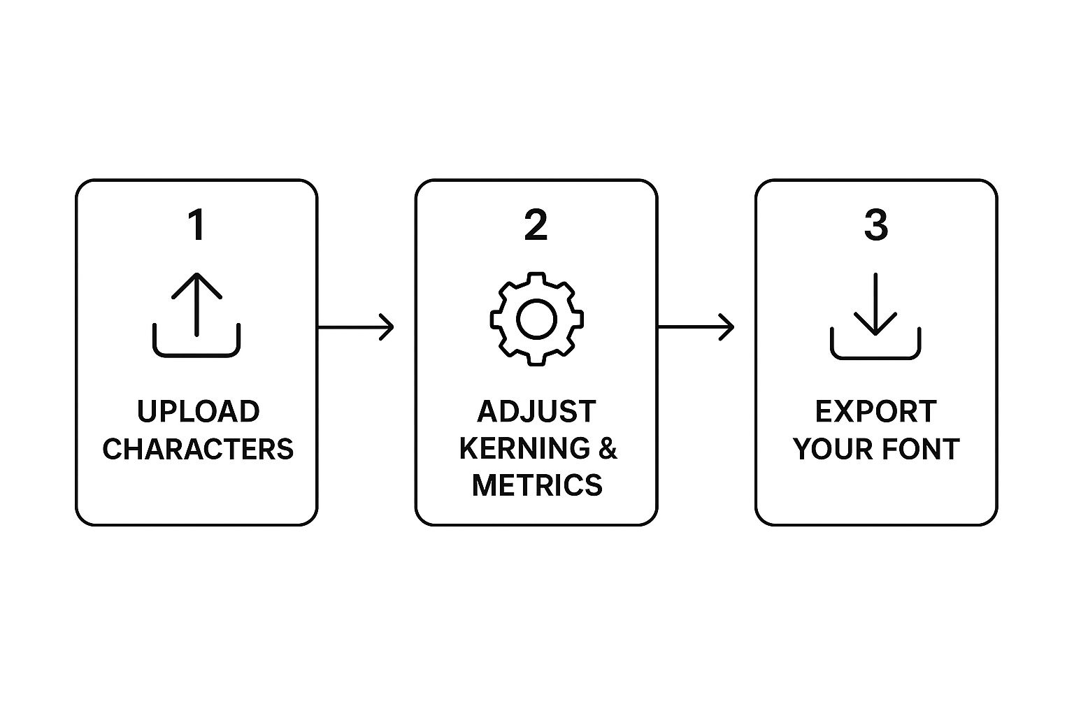
The journey from a simple idea to a finished font follows a pretty straightforward path, from that first character generation to the final export.

As this shows, it's those crucial steps of adjusting and refining after the initial generation that really lead to a polished, usable font file.
Fine-Tuning the Typographic Details
With a consistent set of glyphs ready, it's time to dig into the details that separate an amateur font from a professional one. This means tweaking the spacing and positioning of your characters so they play nicely together in actual words and sentences.
Kerning is a massive part of this. It's all about adjusting the space between specific pairs of letters to make them look more balanced. For example, the natural gap between an 'A' and a 'V' can look like a gaping hole. Good kerning tucks them closer together, making the spacing look visually correct. While many free online font creator tools, including any good AI font generator, handle the basics automatically, some give you manual controls to perfect these pairs. Honestly, even tiny adjustments can make a huge impact on your font's legibility and overall aesthetic.
This same attention to detail is just as crucial when you’re creating other custom assets. You can see how this plays out in our guide on using an AI signature generator for creating a truly personalised sign-off.
By guiding the AI with strong prompts and then carefully refining what it gives you, you can create a high-quality, custom font without needing any prior design experience.
Making Your Font Look Polished and Professional

Alright, moving from a rough concept to a high-quality typeface is all about the little things. It’s these tiny, almost invisible details that separate amateur work from professional typography, turning a jumble of letters into a cohesive, functional font that just works.
The first rule of thumb is consistency. Every single character, from 'A' to 'Z', needs to feel like it's part of the same family. This means keeping your stroke weight—the thickness of the lines—the same across the board and making sure the curves on a 'b' have the same feel as the curves on an 's'. A great font feels unified, not like a mismatched collection of letters.
Nail Readability at Every Size
Here's the real acid test for any font: legibility. A typeface that looks absolutely stunning as a huge headline can quickly turn into an unreadable smudge when you shrink it down for body text. Before you even think about calling it done, you have to test it at a whole range of sizes.
Be on the lookout for these common traps:
- Closed Counters: Do the little enclosed spaces in letters like 'e' or 'a' start to fill in and look blobby at small sizes?
- Fine Details: Are your delicate serifs or super-thin strokes just disappearing when the font gets tiny?
- Character Distinction: Can you still easily tell the difference between 'i', 'l', and '1'? This one is crucial.
A truly professional font does the heavy lifting for the reader. It has to be clear whether it’s blown up on a billboard or squeezed onto a smartwatch screen. That versatility is the true sign of great typographic design.
This focus on clarity isn't just a design principle; it's a massive trend. In fact, the UK is one of the top five countries globally using Google Web Fonts, with over 500,000 UK-based websites relying on them. Just look at the legal sector, where the free font Open Sans pops up on around 14,000 UK legal websites. It's proof that people gravitate towards modern, highly legible typefaces. If you want to dive deeper into these trends, check out the stats over on TonerBuzz's blog.
The Subtle Art of Perfect Spacing
Last but not least, let's talk about kerning. This is the secret sauce. It’s the process of manually adjusting the space between specific pairs of letters to make them look visually balanced. If you skip this, you end up with awkward gaps that just throw off the whole reading experience.
Think about common letter combos like 'AV', 'To', or 'WA'. Without kerning, the natural spacing creates these ugly, distracting voids. Good kerning tucks these letters closer together, creating a harmonious flow that’s pleasing to the eye. While a lot of free online font creator tools, including a good AI font generator, will handle some of this for you automatically, the best ones always give you manual controls.
Taking the time to get in there and fine-tune those letter pairs makes a world of difference. It’s a subtle art, for sure, but mastering it is what elevates your custom font from a fun side project to a polished, professional, and genuinely usable design asset.
Getting Your Custom Font Out into the World
You’ve done the creative part and designed a font that’s completely yours. Awesome. Now it's time to actually use it. Taking your design from a free online font creator or AI font generator and turning it into a file you can install on your computer or upload to your website is the final hurdle. This is where your typeface goes from a project on a screen to a real-world asset.
When you click that 'export' button, you'll see a few different file types. They might look like alphabet soup at first, but each one has a specific job. Picking the right one is key to making sure your font works perfectly and doesn't slow anything down.
Choosing the Right File Format for the Job
Let's break down the common formats you'll run into. Knowing what they're for will ensure your font behaves exactly how you expect, wherever you use it.
- OTF (OpenType Font): Think of this as the modern workhorse for desktop use. It's the go-to format for professional design work in apps like Adobe Illustrator or Affinity Designer because it can handle more advanced typographic features. If you're doing serious graphic design, this is probably what you want.
- TTF (TrueType Font): This one has been around for a while, but it's incredibly reliable. TTF offers fantastic compatibility across both Windows and macOS. If you just need a font that works everywhere for general documents and designs and you're not sure which to pick, TTF is a super safe bet.
- WOFF/WOFF2 (Web Open Font Format): These two are built for the internet. WOFF, and its much-improved successor WOFF2, are compressed specifically for web use. This means your custom font loads lightning-fast on your website without making your visitors wait.
Bottom line: Choose OTF or TTF for creating things on your computer, like documents or graphics. Go with WOFF or WOFF2 to bring your unique typography to life online.
Putting Your Font to Work
Once you've downloaded the file, you need to install it. This is usually pretty painless. On both Windows and macOS, you can often just double-click the font file and hit 'Install'. Simple as that. If you need a bit more guidance, our guide on how to install fonts for Windows breaks it down step-by-step.
For all the web designers out there, getting your font onto a site means adding a little snippet of CSS code. You'll use what's called the @font-face rule to tell browsers where to find your font file and how to use it on your text.
It looks something like this:
@font-face {
font-family: 'MyCustomFont';
src: url('mycustomfont.woff2') format('woff2');
}
body {
font-family: 'MyCustomFont', sans-serif;
}
This bit of code ensures that anyone who visits your website sees your text exactly as you designed it, with your unique font front and centre.
With the font design market set to rocket past $1.3 billion by 2031, it's clear that custom typography is in high demand. For UK startups and freelancers, a free online font creator (and especially an AI font generator) is a brilliant way to get a professional look without the hefty price tag of traditional software. You can read more about this market growth on AMR.
Got Questions About Free Font Creators? We've Got Answers
Diving into the world of typography always sparks a few questions. Whether you're a seasoned designer trying out an AI font generator for the first time or a total beginner, it’s smart to get a handle on the practical stuff—like licensing and file types—before you get too deep into the creative zone.
Getting these details sorted upfront means you can focus on the fun part: designing something awesome. Let's tackle some of the most common queries that pop up when using a free online font creator.
Can I Actually Use My Fonts for Commercial Stuff?
This is the big one, and the short answer is: it really depends on the tool's licence.
Most platforms are totally cool with you using your creations for personal projects—think a custom font for your blog, a school project, or a party invitation. No problem there.
But commercial use? That’s a whole different ball game. We're talking about logos, products you plan to sell, or work you're doing for a client. Some font creators, including many AI font generator platforms, give you full commercial rights right off the bat. Others might ask for a one-time fee, a subscription, or just a simple credit. Always, always read the terms of service before you roll out your new font in a commercial project.
Seriously, don't skip the fine print. Understanding the licensing isn't just a friendly suggestion—it’s what keeps you and your business safe from legal headaches. A quick five-minute check can save you a world of trouble later.
If you want to get into the nitty-gritty, it's worth reading up on the details of font licensing for commercial use. It’ll help you make sure you’re always playing by the rules.
Can I Go Back and Edit My Font Later On?
You bet. A hallmark of any good free online font creator or AI font generator is the ability to save your projects. This means you can pop back in anytime to make tweaks and refinements.
Maybe you spotted a character that needs a little finessing, want to add a few new symbols, or need to adjust the kerning for better readability. While the file you export (like a TTF or OTF) is fixed, your original project file within the platform should stay live and editable. Pro tip: always choose a tool that lets you save your work-in-progress. It gives you so much more flexibility as your design evolves.
What's the Deal with OTF, TTF, and WOFF Files?
Think of these as different wrappers for your font data, each built for a specific job. They might sound technical, but it's pretty straightforward.
Here’s a quick breakdown:
- TTF (TrueType Font): This is the old reliable. It's an older format, but its biggest strength is its near-universal compatibility. It just works on almost every operating system out there, making it a solid choice for general desktop use.
- OTF (OpenType Font): The modern successor to TTF. Designers often prefer OTF because it can pack in more advanced features, like cool ligatures and alternate characters that can give your typography some extra flair.
- WOFF/WOFF2 (Web Open Font Format): These are your go-to files for the web. They're specially compressed to be as small as possible, which means your custom font will load lightning-fast on a website. That's a huge deal for keeping visitors happy and your SEO in good shape.
Ready to stop searching and start creating? The AI Font Generator provides over 1,400 styles to bring your text to life instantly. Generate stunning, copy-paste-ready font images for any project, completely free. https://aifontgenerator.com