Old style typefaces are a cornerstone of typography, defined by their humanistic, calligraphic roots that make them incredibly readable, especially for long stretches of text. They have a classic, warm, and familiar feel, thanks to three key features: diagonal stress, low contrast between thick and thin strokes, and bracketed serifs. You can even use an AI font generator to experiment with and visualize these typefaces instantly.
What Makes a Typeface Old Style?
To really get what old style is all about, you have to picture a scribe from the 15th century, writing with a broad-nibbed pen. These typefaces are a direct evolution of that human hand. They weren't engineered; they were written. This handmade origin is what gives them their most defining quality and why they still feel so natural to our eyes today.
Unlike the rigid, almost mechanical letterforms that popped up later, old style fonts have an organic warmth. They were literally designed to be read, not just glanced at, making them the go-to choice for body text in books, magazines, and websites where readability is king.
The Core Characteristics
So, what are the visual clues that scream "old style"? Once you know what to look for, they’re pretty easy to spot. These elements all work in harmony to create a smooth, highly legible reading experience.
- Diagonal Stress: Imagine drawing a line through the thinnest parts of a round letter like an ‘o’. In an old style font, that line will be tilted, usually to the left. This isn't a random design choice; it directly mimics the natural angle of a right-handed calligrapher's pen.
- Low Stroke Contrast: Look at the difference in thickness between the thickest and thinnest parts of a letter. It’s pretty subtle, right? This low contrast creates a balanced, even texture on the page, which is much easier on the eyes over long reading sessions.
- Bracketed Serifs: The serifs—those little "feet" at the end of the strokes—don't just stick out abruptly. They flow smoothly into the main stroke with a gentle curve. This elegant transition is called bracketing.
Put these traits together, and you get typefaces that feel approachable, traditional, and incredibly clear. They don't shout for attention. Instead, they do their job quietly and effectively, guiding the reader’s eye effortlessly across the page.
The story of these fonts is rich, with different regions developing their own unique flavours. In Britain, for example, the old style tradition was cemented by William Caslon in the early 18th century. His foundry, set up in 1737, remained a family business for over 120 years, leaving a massive mark on English typography. The influence of these classic forms is still easy to see in modern lettering font styles today.
It's this timeless appeal that keeps designers coming back to old style typefaces for any project that needs a touch of heritage, elegance, and, most importantly, supreme readability.
The Story of Old Style Typography
Every old style typeface is a time capsule. It tells a story of art, technology, and a massive cultural shift. To really get it, we have to travel back to the 15th century and the heart of the Italian Renaissance—a period buzzing with new ideas and creative fire. Before this, European books were filled with heavy, dense Blackletter scripts. They were beautiful in their own way, but try reading one for more than a few minutes. It's tough.
As printing presses started popping up, people needed something more readable, more graceful. Early typographers found their muse in the humanist minuscule script popular among Italian scholars. This handwritten style was praised for its clarity and elegance, making it the perfect blueprint for the new world of movable type.
The Venetian Dawn
Venice was the epicentre of this typographic revolution. A bustling hub of trade and printing, it was the perfect place for innovation to flourish. It was here, around 1470, that a French engraver named Nicolas Jenson created some of the very first Roman typefaces.
What Jenson did was nothing short of brilliant. He managed to capture the organic, flowing feel of calligraphy in cold, hard metal type, laying the groundwork for everything we now call old style. His fonts weren't just about function; they were works of art, perfectly embodying the Renaissance ideal of balancing human creativity with technical skill. This fresh style didn't stay in Italy for long—it quickly spread across Europe.
From there, the movement found a new home in France. In the 16th century, printers like the legendary Claude Garamond took the Venetian models and refined them, creating typefaces that were even more consistent and elegant. Garamond's designs were so influential they became the gold standard for typography for the next 150 years.
These early old style fonts were more than just letters on a page; they were a bridge. They connected the ancient art of the handwritten manuscript to the new era of mass communication, making knowledge more accessible than ever before.
British Refinement and Lasting Influence
The story then hops over to Britain, where designers put their own spin on old style fonts, perfecting them for a new audience. British typography developed its own distinct voice, resulting in designs that felt both classic and incredibly practical. A key moment came in the mid-19th century from the Edinburgh-based foundry Miller & Richard. Around 1860, they released their "Old Style" fonts, which took inspiration from earlier designs but were modernised for the demands of the day.
These typefaces became a massive hit in the UK. One publication in the 1880s even described their success as "unsurpassed in the annals of type-founding." You can dive deeper into this fascinating part of the story over on Wikipedia.
This whole journey, from Venetian workshops to British foundries, shows how old style fonts evolved with the times while holding onto their humanistic soul. Each new version added another layer to a rich and ongoing story.
And that story is still being written today, often in surprising ways. For instance, an AI font generator can now analyse centuries of these historic designs to spit out something totally new that still carries that classic DNA. By understanding the core rules—like diagonal stress and bracketed serifs—these modern tools can generate custom typefaces that feel both timeless and completely fresh. The journey of old style typography is far from over; it's just entering its next exciting chapter.
How to Identify Old Style Fonts
Becoming a font detective is easier than you might think. Spotting old style typefaces in the wild just requires knowing a few key visual clues. Once you train your eye, you'll start seeing their unique, humanistic character everywhere, from the pages of a classic novel to the body text of a sophisticated website.
Think of it like learning to identify a specific type of tree. At first, they might all look the same, but soon you'll recognise the distinct shape of the leaves and the texture of the bark. Old style fonts have their own set of tell-tale signs, all rooted in the graceful imperfections of handwritten calligraphy.
The Telltale Lean of Diagonal Stress
The single most important identifier is diagonal stress. It sounds technical, but it’s actually pretty simple. Just imagine drawing a line through the thinnest parts of a round letter like the lowercase ‘o’.
With an old style font, that line will always be tilted, leaning slightly to the left. This isn’t just a stylistic choice; it's a direct echo of how a right-handed scribe’s quill would naturally move across parchment. This subtle angle gives the entire text a sense of rhythm and forward momentum, gently guiding your eye along the line.
This close-up of carved metal type shows the tiny, intricate details that give serif styles their character.
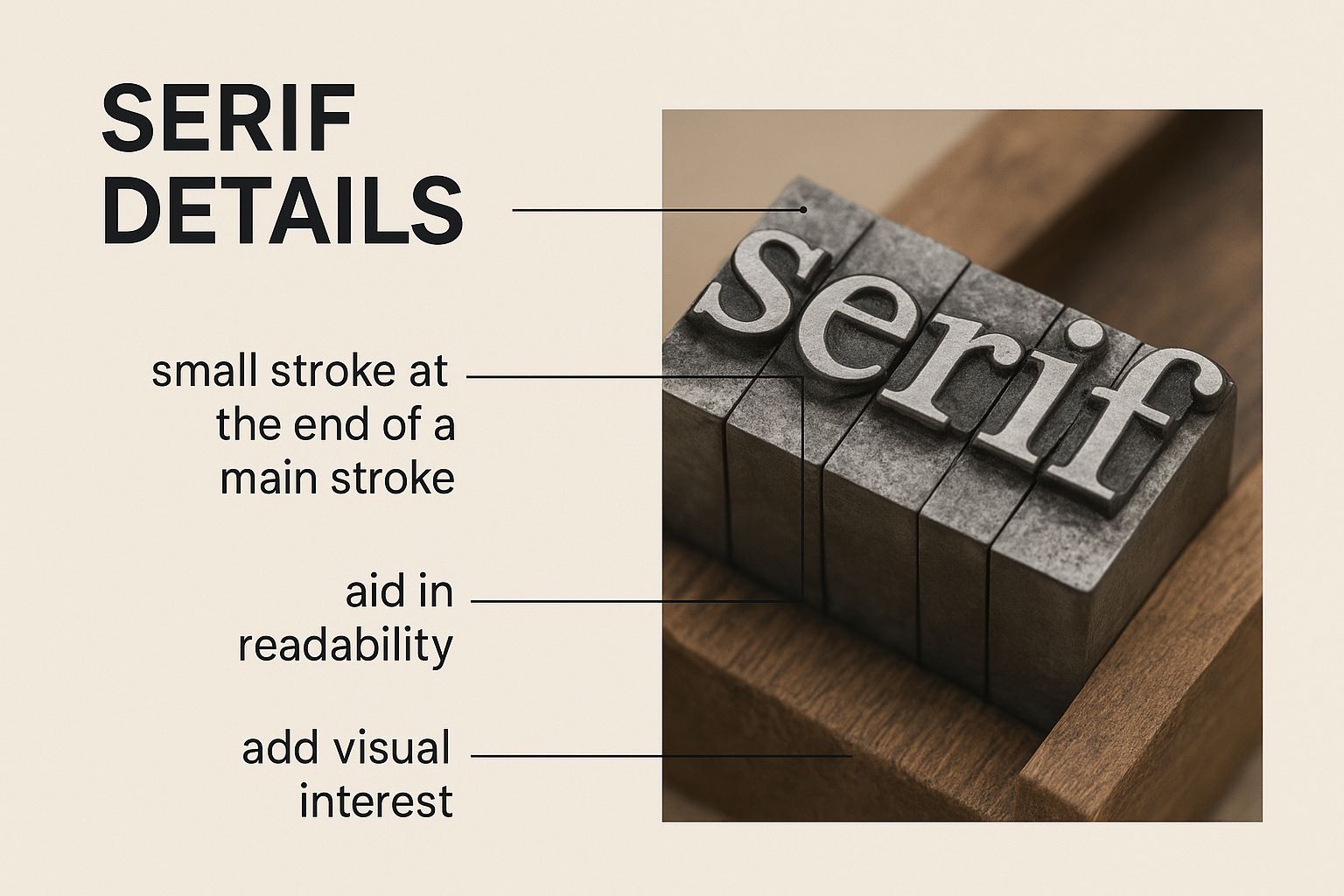
It really highlights how these small, handcrafted details, like the gentle curve of a serif, are fundamental to the font's overall feel and readability.
Graceful Curves and Low Contrast
Next up, take a close look at the serifs—those little "feet" at the ends of the letter strokes. In an old style typeface, these are bracketed serifs. This just means they don’t jut out at a sharp angle; they flow into the main stroke with a graceful, concave curve.
That smooth transition reinforces the font’s connection to the fluid motions of a pen. It also adds a touch of elegance and helps the letters blend together, creating a harmonious and incredibly readable line of text. Another key trait is the low contrast between the thick and thin parts of a letter. The difference is subtle, which creates a balanced and even colour on the page that’s much easier on the eyes during long reading sessions.
When you put diagonal stress, bracketed serifs, and low contrast together, you get a typeface that feels organic, warm, and exceptionally clear. These aren’t fonts that shout; they speak in a calm, assured voice.
Tools like an AI font generator can help you test and compare old style fonts in real time, making you a more efficient font detective.
Old Style vs. The Rest: A Direct Comparison
The best way to truly get what makes old style fonts unique is to see them side-by-side with their typographic descendants. Both Transitional and Modern typefaces evolved from Old Style, but each one took a step further away from calligraphic tradition and toward a more geometric, mechanical look.
Once you compare them directly, the differences become glaringly obvious. This contrast shows the specific design choices that give each category its distinct personality and purpose. Looking through different fonts for art projects is another great way to see these subtle distinctions in action.
To make it even clearer, here’s a quick breakdown of the key characteristics.
Comparing Serif Typeface Styles
This table contrasts the key characteristics of Old Style, Transitional, and Modern serif typefaces to help you distinguish between them.
| Characteristic |
Old Style (e.g., Garamond) |
Transitional (e.g., Baskerville) |
Modern (e.g., Bodoni) |
| Stress |
Diagonal, mimicking a pen's angle |
Closer to vertical, but still slightly angled |
Perfectly vertical and rigid |
| Contrast |
Low and subtle between thick and thin strokes |
Moderate, with a more noticeable difference |
Extreme, with hairline thins and bold thicks |
| Serifs |
Bracketed and rounded with a gentle curve |
Sharper and more defined, but still bracketed |
Unbracketed, appearing as thin, straight lines |
| Overall Feel |
Humanistic, warm, and highly readable |
Refined, sharp, and more formal |
Dramatic, elegant, and geometric |
By using this simple checklist—stress, serifs, and stroke contrast—you’ll be able to confidently spot old style typefaces and appreciate why they remain a cornerstone of beautiful typography. Their design isn’t just about looking good; it's a masterclass in creating a comfortable and engaging reading experience.
Meet the Old Style Legends
Dipping your toes into the world of old style typefaces is like strolling through a hall of fame for typography. While there are countless variations out there, a handful of legendary families have really set the standard for centuries. These aren't just fonts; they're masterclasses in design, each with its own story and a personality that still inspires designers today.
Getting to know these titans is a must for any designer. When you understand their roots, their unique quirks, and where they shine brightest, you gain a powerful toolkit for any project that needs a touch of tradition, elegance, and serious readability. Let’s get acquainted with the big names of the old style universe.
Garamond: The French Icon of Elegance
When you think "old style," Garamond is probably the first name that pops into your head. Named after the 16th-century Parisian punchcutter Claude Garamond, this typeface is the very picture of French Renaissance elegance. It's famous for its graceful, flowing letterforms and an almost calligraphic touch that makes text feel both sophisticated and incredibly easy on the eyes.
What makes Garamond, well, Garamond?
- A small x-height, giving it that classic, airy look.
- Long ascenders and descenders that create a beautiful, flowing rhythm across the page.
- Subtle little quirks in its letterforms, which keep it feeling warm and human.
Garamond is an absolute dream for literary works, academic papers, or any design that needs to whisper "intellectual heritage" and "artistry." Its digital versions are still go-to choices for body copy, both in print and on screen.
Caslon: The Sturdy British Workhorse
If Garamond is the graceful French courtier, Caslon is the dependable British statesman. Designed by William Caslon in the 18th century, this typeface is celebrated for its sheer practicality, sturdiness, and amazing legibility. There’s an old saying in printing: "When in doubt, use Caslon." That tells you everything you need to know about its versatility and timeless appeal.
Caslon feels a bit more robust than Garamond, with slightly more contrast between thick and thin strokes and a stronger, more grounded feel on the page. It walks that perfect line between traditional and approachable, making it a brilliant pick for everything from historical documents to fresh, modern branding.
The British fondness for old style serifs like Caslon was so strong that it held on even as flashy new slab and sans serif styles exploded in the 19th and early 20th centuries. It was a fascinating time of typographical tug-of-war. You can learn more about this design evolution over at Toptal.
Jenson and Bembo: The Venetian Pioneers
To really get to the heart of old style, we have to go back to 15th-century Venice. Around 1470, a French engraver named Nicolas Jenson, working in the city, created one of the very first Roman typefaces. He brilliantly translated the look of humanist handwriting into metal type, setting the blueprint for what we now call old style. Jenson's work is admired for its incredible clarity, even texture, and open, friendly letterforms.
Jenson's typeface laid the foundation for every old style that followed. He captured the spirit of the Renaissance, making knowledge both beautiful and easy to access.
Just a bit later, in 1495, a typeface cut by Francesco Griffo was used in Aldus Manutius’s print shop for a book by Pietro Bembo. This design, now known as Bembo, became a massive influence. It took Jenson’s model and refined it, hitting a new high note of grace and harmony. Bembo is still treasured for its perfect proportions and fantastic readability, making it a forever favourite for book designers.
These foundational typefaces are far from being dusty museum pieces; they're living, breathing designs. Modern tools, like an AI font generator, can actually study the design DNA of these classics—the angled stress, the bracketed serifs, the humanistic proportions—to create brand-new fonts. This means designers can now generate unique typefaces that have the soul of Garamond or the sturdiness of Caslon but are built perfectly for today's projects.
Using Old Style Fonts in Modern Projects
Bringing a 500-year-old design principle into a slick, modern layout might sound like a recipe for disaster, but old style typefaces are actually a secret weapon for today’s designers. Their humanistic feel and incredible readability make them the undisputed champions of long-form content. For books, websites, and articles where clarity is everything, they're pure gold.
The trick is to understand their personality. These fonts don't shout from a billboard; they speak with a measured, trustworthy voice. Play to their strengths, and you'll create designs that feel both timeless and perfectly at home in the digital age.
Pairing for Sophisticated Hierarchy
One of the most powerful moves you can make is pairing an old style typeface with a clean, modern sans-serif. It's a classic combination for a reason. This contrast creates a brilliant typographic hierarchy, guiding the reader’s eye and adding a satisfying visual tension. The warmth of a traditional body text against a crisp, minimalist heading is a hallmark of sophisticated design.
Think about these tried-and-true pairings:
- Garamond (Old Style) with Helvetica Now (Sans-Serif): This duo perfectly balances classical elegance with modern neutrality. The result is a look that’s professional, sharp, and ridiculously readable.
- Caslon (Old Style) with Futura (Sans-Serif): Caslon’s sturdy, dependable nature plays beautifully off Futura’s geometric precision. It’s an ideal match for projects that need to feel authoritative yet forward-thinking.
- Bembo (Old Style) with Gill Sans (Sans-Serif): This all-British pairing combines Bembo’s literary grace with the friendly, almost-human feel of Gill Sans, creating a design that’s warm and wonderfully inviting.
The whole point of pairing is to create a clear visual difference between different types of information. A well-chosen sans-serif heading grabs your attention, while the old style body text makes settling in for a long read a comfortable, seamless experience.
To really get your pairings right, it helps to have the right tools in your corner. Exploring the best graphic design tools for designers can give you the precise typographic control needed to fine-tune your combinations for maximum impact.
Optimising for Digital Screens
Old style fonts may have been born in the age of ink and printing presses, but they’ve been masterfully adapted for the digital world. Still, making them look their best on a screen takes a little extra care. Getting the sizing, spacing, and leading (that’s the line height) just right is non-negotiable for avoiding eye strain and keeping readers engaged.
Follow these simple rules for amazing on-screen legibility:
- Pick a Digital-First Version: Don't just grab any old Garamond. Use a version specifically built for web and screen use, like Adobe Garamond Pro or Caslon AD. These "digital revivals" often have tweaked proportions and better hinting, which helps them render cleanly on screens.
- Go Big (Enough): For body text, you’ll want to be in the 16px to 18px range. This ensures your text is comfortable to read on everything from a huge desktop monitor to a tiny mobile phone.
- Give it Room to Breathe: Set your line height to somewhere between 1.4 and 1.6 times the font size. This creates just enough white space between lines to stop the text from feeling dense and claustrophobic.
Before you lock in your choice, remember to get the legal side sorted. You can dive deep into the details with our guide to font licensing for commercial use to make sure your projects are completely above board. By blending timeless aesthetic rules with smart, modern techniques, you can make any old style typeface shine, lending your project an air of credibility that never goes out of style.
Crafting Classic Fonts with AI
The story of old style typefaces, a journey from Renaissance workshops to today's design studios, is taking a fascinating turn. The very human-centred principles that defined these classic fonts are now being reinterpreted by artificial intelligence, giving us a powerful new way to connect with typographic history. An AI font generator isn’t just for making futuristic letterforms; it can also be a student of the past.
By digging into the DNA of old style typefaces—their classic diagonal stress, subtle contrast, and trademark bracketed serifs—these AI systems can learn the foundational rules of classic design. This means designers can now generate entirely new fonts that capture the spirit of Garamond or the solid feel of Caslon, but are built for modern screens and uses. It’s not about replacing tradition, but extending it, opening up a digital sandbox to play with centuries-old ideas.
Guiding AI with Classic Principles
To create a classic-inspired font with AI, you need to give it the right instructions. The trick is to translate the visual language of old style typefaces into descriptive prompts the AI can actually understand. Think of yourself as the creative director, guiding the machine's hand.
If you're new to prompting generative models, getting a handle on how to communicate your vision clearly is essential. Resources like AI art prompt guides can be a great place to start learning how to craft precise instructions.
A designer might use prompts that focus on specific features:
- "Generate a Roman typeface with low stroke contrast and subtle, bracketed serifs."
- "Create a letter 'o' that shows distinct diagonal stress, like you'd see in a 16th-century Venetian font."
- "Design a font with humanistic proportions and open counters to make it easy to read."
By being this specific, you steer the AI away from generic, soulless results and toward a design that truly respects the subtle details of old style typography. The machine does the heavy lifting of rendering, freeing you up to focus on the artistic vision.
This whole process really is the best of both worlds. It fuses the timeless elegance of classic letterforms with the incredible speed and flexibility of modern tech. For designers, this opens up an amazing new ability to revive, reimagine, and customise historical styles, ensuring the legacy of old style typefaces keeps evolving in exciting ways.
Got Questions? We've Got Answers
Dipping your toes into the world of old style typefaces can spark a few questions, especially when you're trying to fit these classics into a modern design. Let's clear up some of the most common queries so you can start using these fonts with confidence.
What's the Real Difference Between Old Style and Modern Typefaces?
Think of it like this: an old style typeface is a handcrafted wooden chair, while a modern typeface is a sleek, moulded plastic one. They both do the same job, but the feel is completely different.
Old style fonts have a diagonal stress and low contrast between thick and thin strokes. This was born from the natural angle of a calligrapher's pen, giving the letters a warm, organic feel that’s incredibly easy on the eyes. It's why they're so brilliant for long blocks of text.
Modern typefaces, on the other hand, push things to the extreme. They have a strict vertical stress, super high contrast between strokes, and thin, unbracketed serifs. It’s a much more dramatic, geometric look that's built to grab attention in headlines and displays, not for settling in with a good book.
Can I Actually Use Old Style Fonts on Websites?
Absolutely! And you really should. Many of the great old style families have been carefully remastered for screens, making them fantastic choices for digital projects. Their humanistic roots and open shapes translate beautifully to pixels, giving websites, blogs, and ebooks a comfortable reading experience that feels effortless.
The key is to use a version specifically optimised for the web. Pay attention to the details: aim for a body text size of 16–18px and set your line spacing somewhere around 1.4–1.6. These small tweaks make a world of difference, ensuring your text is clear and legible whether it's on a huge monitor or a tiny phone screen.
Here's something people often miss: these fonts carry an inherent sense of trust. If your content needs to feel credible, well-researched, or authoritative, an old style typeface instantly lends it an air of classic reliability.
How Do I Pick the Right Old Style Typeface for My Project?
Let the project's personality be your guide. What's the message you're trying to send?
If you’re aiming for something sophisticated, literary, or artistic, you can't go wrong with classics like Garamond or Bembo. Their elegant, graceful forms are a perfect fit for high-end brands or cultural institutions.
Need something that feels more traditional, sturdy, and rock-solid? Caslon is your workhorse. It’s got a robust character that communicates stability and trustworthiness like nothing else. And if you want to capture the pure, refined spirit of the Renaissance, give Jenson a try.
Honestly, the best way to know for sure is to try them out. Drop your top contenders into a mockup of your design. Seeing how a font actually lives and breathes alongside your colours, images, and other elements is the only way to find the perfect match.
Ready to bring a touch of classic elegance to your projects? With the AI Font Generator, you can create stunning, custom font images inspired by timeless typographic principles in just seconds. Explore over 1,400 styles and generate the perfect text for your social media, branding, or creative work instantly. Try it for free at https://aifontgenerator.com.