In the world of typography, every character has a personality, but few are as expressive or as challenging to perfect as the letter 'S'. Its elegant curves and complex structure make it a defining feature of any typeface, capable of conveying sophistication, modernity, or playfulness. A well-designed 'S' can set the entire tone for a brand or project, demonstrating how focusing on specifics can have a huge impact. The deliberate choice of a font, even for a single letter, exemplifies the profound impact of what might seem like little changes that make a big difference in content.
This guide explores a curated selection of different fonts for the letter S, showcasing how this single character varies dramatically across iconic typefaces. We will delve into the unique characteristics of each 'S', from the stoic neutrality of Helvetica to the dramatic flair of Bodoni and the whimsical nature of Comic Sans. Understanding these nuances is key to mastering typography and making your designs truly stand out. Furthermore, we will also touch upon the emerging role of an ai font generator, which offers new avenues for creating customised and unique letterforms for your specific projects. Prepare to see the letter 'S' like never before.
1. Helvetica: The Standard of Neutrality
When exploring different fonts for the letter S, starting with Helvetica is like beginning a study of modern architecture with the skyscraper. It is a foundational, ubiquitous design that sets the standard for sans-serif neutrality. Developed by Max Miedinger in 1957, Helvetica’s 'S' is a masterclass in balance and clarity. Its form is characterised by perfectly balanced upper and lower curves, a uniform stroke weight with almost no variation, and horizontal terminals on its endpoints. This creates a letterform that is highly legible, objective, and devoid of any overt personality, making it a powerful tool for clear communication.
Why It Excels for an ‘S’
The strength of Helvetica's 'S' lies in its deliberate lack of stylistic flair. It doesn't lean, it doesn't embellish, and it doesn't distract. This neutrality is precisely what makes it so effective in corporate and public-facing applications where trust, authority, and reliability are paramount. Brands like American Airlines, BMW, and the New York City subway system have built their visual identities on this foundation of straightforward legibility. The 'S' in their logos is clean, confident, and functional, reflecting the core values they wish to project.
This infographic summarises the core attributes that define Helvetica’s iconic ‘S’.
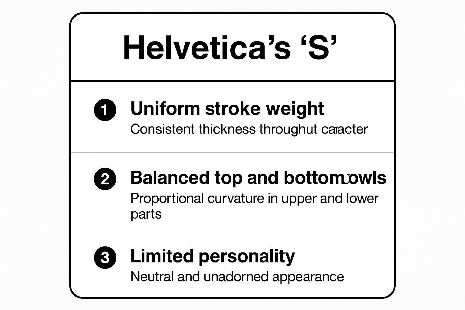
The visualisation highlights how the letter's structural simplicity and balance contribute to its overall neutral and highly functional character.
Practical Implementation
To leverage Helvetica effectively, consider these actionable tips:
- Corporate Branding: Use it for logos, annual reports, and corporate websites where a tone of professionalism and stability is essential.
- Typography Pairing: Pair Helvetica with a classic serif font like Garamond or Times New Roman. This contrast creates a dynamic and readable hierarchy, perfect for long-form content.
- Digital Use: For optimal rendering on screens, opt for Helvetica Neue. This updated version was specifically designed with improved legibility for digital interfaces.
- AI Font Generation: When using an ai font generator, you can specify "a sans-serif font inspired by Helvetica's neutrality" to create custom typefaces that carry a similar sense of clarity and modernism but with a unique twist.
2. Times New Roman: The Archetype of Authority
If Helvetica represents modern neutrality, Times New Roman is its distinguished, scholarly ancestor. When examining different fonts for the letter S, the 'S' in Times New Roman provides a lesson in traditional typographic authority. Commissioned by the British newspaper The Times in 1931 and designed by Stanley Morison, this typeface was engineered for legibility in print. Its 'S' is a hallmark of the serif style, featuring graceful, bracketed serifs that ground the letter, and a visible contrast between its thicker and thinner strokes. This creates a letterform that feels both elegant and robust.
Why It Excels for an ‘S’
The power of the Times New Roman 'S' lies in its perfect fusion of readability and formality. The serifs guide the eye smoothly across the page, making it exceptionally comfortable for long-form reading, while the subtle stroke variation adds a touch of classical elegance. This balance has cemented its status as the default for academic papers, legal documents, and the book publishing industry. The 'S' in these contexts communicates seriousness, tradition, and intellectual rigour. It is a letterform that demands to be taken seriously, conveying a sense of established credibility.
The design of Times New Roman draws from older, highly legible typefaces, which you can explore further in this guide to Old Style Typefaces on aifontgenerator.com. This historical context is key to understanding its enduring appeal and professional character.
Practical Implementation
To utilise the formal authority of Times New Roman effectively, consider these tips:
- Formal Documents: It is the ideal choice for the body text of academic essays, legal contracts, and business reports where clarity and a professional tone are paramount.
- Readability: For optimal legibility in print and on screen, stick to a 12-point size for body copy. Anything smaller can strain the eyes.
- Digital Adaptation: When using it for digital content, slightly increase the line spacing (leading) to improve on-screen readability and prevent text from feeling cramped.
- AI Font Generation: When working with an ai font generator, you can request "a classic serif font with the readability of Times New Roman" to produce a custom typeface that shares its authoritative and highly legible characteristics.
3. Futura: The Epitome of Geometric Purity
If Helvetica represents neutrality, Futura embodies geometric perfection. Created by Paul Renner in 1927 and heavily influenced by the Bauhaus movement, Futura's 'S' is a study in pure form. It is constructed from simple geometric shapes, primarily circles, resulting in a letterform with almost perfectly circular upper and lower bowls. This commitment to geometry gives the 'S' a clean, modern, and forward-looking aesthetic that feels both timeless and efficient. The uniform stroke weight reinforces its minimalist and highly structured character.
Why It Excels for an ‘S’
The power of Futura's 'S' lies in its bold, unapologetic modernism. Its precise, almost mathematical construction conveys a sense of innovation, purpose, and clarity. This makes it an ideal choice for brands that want to appear progressive, sophisticated, and design-led. Iconic brands like Volkswagen and Supreme have leveraged this font's clean lines to build powerful visual identities. The 'S' in their logos is not just a letter; it is a statement of efficiency, style, and avant-garde thinking, popularised in everything from NASA mission patches to the distinct filmography of Wes Anderson.
Practical Implementation
To harness the geometric strength of Futura, consider these actionable strategies:
- Technology and Innovation Branding: Its clean, futuristic feel makes it perfect for tech companies, architectural firms, and fashion labels aiming for a modern, minimalist image.
- Headlines and Display Text: Futura shines in short, impactful text blocks. Use it for headlines, pull quotes, and logos where its geometric form can be fully appreciated without overwhelming the reader.
- Strategic Pairing: For a dynamic visual contrast, pair Futura’s clean structure with an elegant script font. This juxtaposition creates a sophisticated and engaging typographic hierarchy.
- AI Font Generation: When using an ai font generator, prompt it with phrases like "create a geometric sans-serif font inspired by Futura's circular forms" to generate bespoke typefaces that capture its modernist spirit while offering a unique variation.
4. Script MT Bold: The Essence of Cursive Elegance
Moving into the realm of decorative typography, Script MT Bold offers a completely different perspective on the letter S. It embodies the grace and flow of traditional calligraphy, presenting an 'S' that is less about static legibility and more about artistic expression. Designed by Freda Sack, this font features a classic cursive letterform where the 'S' is defined by its varied stroke weight, mimicking the pressure of a calligrapher's hand. Its elegant entry and exit strokes are crafted to connect seamlessly with adjacent letters, creating a sophisticated, handwritten feel that conveys luxury and formality.
Why It Excels for an ‘S’
The power of Script MT Bold's 'S' lies in its ability to evoke a sense of personal touch and high-end sophistication. Unlike the neutral sans-serifs, this font’s 'S' is full of character and emotion. Its flowing, uninterrupted lines are perfect for applications where an impression of artistry and distinction is paramount. This makes it a popular choice for wedding invitations, certificates, luxury brand packaging, and high-end restaurant menus. The 'S' in these contexts isn't just a letter; it's a decorative element that enhances the overall aesthetic and signals a premium experience. Its cursive form has been popularised by the wedding industry and luxury goods sector for its timeless appeal.
Practical Implementation
To use Script MT Bold's elegance effectively, consider these actionable guidelines:
- Headlines and Accents: Reserve this font for headlines, logos, or short, impactful phrases. Its decorative nature can hinder readability in long blocks of text.
- Typography Pairing: Create a clear visual hierarchy by pairing Script MT Bold with a clean, simple sans-serif font like Lato or Open Sans. This contrast ensures the main body text is legible while allowing the script font to stand out.
- Sizing is Key: Ensure the font is used at a large enough size for its delicate details and varying stroke weights to be clearly visible, especially in print.
- AI Font Generation: When using an ai font generator, you can request "a sophisticated cursive font like Script MT Bold" to produce unique typefaces with a similar calligraphic flair. For more inspiration, you can explore the variety of options available in the world of cursive fonts; learn more about the best cursive fonts to copy and paste on aifontgenerator.com.
5. Impact: The Condensed Heavyweight
When discussing different fonts for the letter S that are designed for pure visual force, Impact stands in a category of its own. Created by Geoffrey Lee in 1965, Impact was designed to do exactly what its name suggests: make a powerful, immediate impression. Its 'S' is a study in compression and weight. The letterform is characterised by an extremely condensed width, a thick, uniform stroke, and minimal negative space within its curves. This creates an 'S' that is less about graceful flow and more about solid, unyielding presence, demanding attention in any context.
Why It Excels for an ‘S’
The power of Impact's 'S' lies in its ability to occupy minimal horizontal space while delivering maximum visual weight. This density makes it an unparalleled choice for headlines, posters, and any text that needs to shout. Its tight spacing and bold, assertive form convey urgency and importance without ambiguity. This is why it became a mainstay in newspaper headlines, political campaign materials, and sports merchandise. More recently, its unmistakable look has been co-opted by internet meme culture, proving its enduring ability to capture and hold attention in a crowded visual landscape.
This infographic summarises the core attributes that define Impact's commanding ‘S’.
The visualisation highlights how the letter's condensed structure and heavy strokes contribute to its overall powerful and attention-grabbing character.
Practical Implementation
To use Impact's assertive style effectively, consider these actionable tips:
- Headline Hero: Reserve Impact exclusively for short, high-impact headlines or key phrases. It is not designed for body text and becomes illegible in long-form content.
- Emphasise with Space: To prevent its heavy letters from feeling cramped, ensure there is ample white space around any text set in Impact. This allows its bold form to breathe and enhances its visual punch.
- Convey Urgency: Use it for warnings, emergency notices, or promotional announcements where grabbing immediate attention is the primary goal. The font’s inherent boldness naturally communicates importance.
- AI Font Generation: When using an ai font generator, you can request "a condensed, heavy sans-serif font inspired by Impact" to generate custom typefaces perfect for strong headlines. You can explore a variety of bold and impactful fonts to find the right fit for your project.
6. Trajan: The Echo of Roman Grandeur
When exploring different fonts for the letter S, Trajan offers a journey back to the grandeur of the Roman Empire. Designed by Carol Twombly in 1989, this typeface is not a modern creation from scratch but a digital revival of the classical letterforms inscribed at the base of Trajan's Column in Rome. Its 'S' is a model of classical elegance, characterised by graceful, sweeping curves, subtle variations in stroke weight, and small, flared serifs that mimic the marks left by a stone carver's chisel. This creates a letterform that feels timeless, authoritative, and deeply rooted in history.
Why It Excels for an ‘S’
The power of Trajan's 'S' lies in its ability to evoke a sense of prestige, history, and monumental importance. The letter’s perfect classical proportions and elegant finish make it a favourite for applications that need to convey solemnity and lasting significance. This is why it has become almost synonymous with Hollywood movie posters for historical epics and dramas, as well as being a staple for memorial inscriptions, museum exhibition titles, and luxury branding. The 'S' in these contexts is not merely a letter; it is a symbol of enduring legacy and sophisticated craftsmanship.
This infographic summarises the core attributes that define Trajan's iconic 'S'.
The visualisation highlights how the letter's classical proportions and carved appearance contribute to its overall tone of historical significance and elegance.
Practical Implementation
To leverage Trajan effectively, consider these actionable tips:
- Prestigious Applications: Reserve Trajan for formal and high-status uses like university diplomas, commemorative plaques, and wine labels. Its inherent grandeur can feel out of place in casual contexts.
- Typography Pairing: For a modern yet classic look, combine Trajan's all-caps titling with a clean, light-bodied sans-serif like Lato or a traditional serif like Garamond for body text. This contrast prevents the design from looking dated.
- Spacing is Key: Always use generous letter spacing, or tracking, when setting words in Trajan. This mimics the open, airy feel of ancient inscriptions and significantly improves its stately appearance and legibility.
- AI Font Generation: When using an ai font generator, prompt it to create "a serif font with the classical proportions and carved elegance of Roman capitalis monumentalis" to generate unique typefaces with a similar historical weight.
7. Comic Sans MS: The Controversial Communicator
No exploration of different fonts for the letter S would be complete without acknowledging the infamous Comic Sans MS. Designed by Vincent Connare to mimic the lettering in comic books, its 'S' is the epitome of casual, hand-drawn character. The letterform is defined by its irregular, rounded curves, a slightly wobbly posture, and a complete lack of sharp angles. This deliberate imperfection creates an 'S' that feels friendly, approachable, and distinctly un-corporate, giving it a warmth that more structured fonts cannot replicate.
Why It Excels for an ‘S’
The strength of the Comic Sans 'S' lies in its ability to instantly signal informality and accessibility. Its soft, rounded form is inherently non-threatening and easy to read, making it a popular choice in environments where a light-hearted or child-friendly tone is desired. This font has been widely adopted in elementary school materials, children's books, and casual notices for precisely this reason. The 'S' in these contexts feels playful and human, stripping away the formality that can sometimes create a barrier in communication. Its widespread recognition, though often for negative reasons, makes it a powerful, if polarising, tool.
Practical Implementation
While Comic Sans is frequently criticised, it can be effective when used thoughtfully. Consider these tips:
- Child-Focused Content: It is an excellent choice for educational materials, party invitations, or any design aimed at a young audience where fun and legibility are key.
- Informal Signage: Use it for casual notices in office kitchens or community centres where a friendly, non-authoritative tone is appropriate.
- Context is King: The primary rule is to avoid it in professional or formal contexts like business reports, corporate branding, or résumés, where it will undermine credibility.
- AI Font Generation: When using an ai font generator, a prompt like "create a casual, hand-drawn font inspired by comic book lettering with a friendly feel" can produce alternatives that capture the spirit of Comic Sans without its controversial baggage.
8. Bodoni: The Epitome of High-Contrast Elegance
Where Helvetica provides neutrality, Bodoni delivers drama and sophistication. As a quintessential example of the modern serif style, Bodoni’s ‘S’ is a study in extreme contrast. Designed by Giambattista Bodoni in the late 18th century, its letterforms are defined by the stark transition between hairline thin strokes and bold, thick verticals. This creates an ‘S’ that feels both delicate and assertive, with an upright, geometric structure and unbracketed, flat serifs that add to its refined and classical appearance. This high-contrast design gives the letter an inherent sense of luxury and poise.
Why It Excels for an ‘S’
The power of Bodoni's 'S' lies in its unapologetic elegance and architectural form. Its dramatic stroke variation demands attention, making it an ideal choice for display purposes where impact is crucial. The letter’s structure is clean and precise, conveying a sense of authority and high fashion. This is why it has become synonymous with luxury and cultural institutions, most famously gracing the masthead of Vogue magazine. The 'S' in high-end branding like this is not merely a letter; it is a statement of style, quality, and timeless appeal.
Practical Implementation
To harness the sophisticated character of Bodoni, consider these actionable tips:
- Luxury and Fashion Branding: Use it for logos, headlines, and packaging in the fashion, beauty, and luxury goods sectors to project an image of elegance and exclusivity.
- Typography Pairing: Bodoni’s complexity calls for a simple partner. Pair it with a clean, geometric sans-serif like Futura or Avenir for body text to ensure readability without visual conflict.
- Display Use: Its delicate hairlines can disappear at small sizes or on low-resolution screens. Use Bodoni for large-scale applications like headlines, posters, and book titles where its details can be fully appreciated.
- AI Font Generation: When using an ai font generator, try a prompt like "create a modern serif font with high-contrast strokes inspired by Bodoni's elegance" to produce a unique typeface suitable for high-end digital or print projects.
Font Style Comparison of 8 Letter S Variants
| Font |
Implementation Complexity 🔄 |
Resource Requirements ⚡ |
Expected Outcomes 📊 |
Ideal Use Cases 💡 |
Key Advantages ⭐ |
| Helvetica |
Moderate - clean, uniform strokes |
Low - widely available, versatile |
High legibility and neutrality |
Corporate, signage, universal designs |
Exceptional legibility, universal appeal, clarity |
| Times New Roman |
Moderate - serif detail and contrast |
Low - standard system font |
Readable, professional, classic |
Academic, legal, long-form text |
Professional credibility, space efficient |
| Futura |
Moderate - geometric precision |
Low to moderate - requires proper spacing |
Modern, clean, strong geometric impact |
Headlines, technology, branding |
Timeless modern look, strong geometric harmony |
| Script MT Bold |
High - varied strokes, flourishes |
Moderate - needs careful sizing |
Elegant, decorative, handwritten effect |
Invitations, certificates, luxury branding |
Adds elegance and personality, memorable style |
| Impact |
Low - heavy, condensed forms |
Low - common display font |
Bold, attention-grabbing |
Headlines, urgent messages, branding |
Maximum impact in tight spaces, strong presence |
| Trajan |
High - classical proportions |
Moderate - all caps only |
Timeless, elegant, historical |
Movie titles, luxury, formal documents |
Classical elegance, cultural gravitas |
| Comic Sans MS |
Low - casual, hand-drawn style |
Low - widely available |
Friendly, informal, approachable |
Children, casual communications |
Approachable, reduces reading anxiety |
| Bodoni |
High - extreme stroke contrast |
Moderate - requires quality printing |
Dramatic, elegant, sophisticated |
Fashion, luxury, display typography |
Visual drama, fashion appeal, refined appearance |
Beyond the Classics: Create Your Own Unique 'S' Instantly
We've journeyed through a curated selection of iconic typefaces, exploring how different fonts for the letter 'S' can dramatically alter the tone and impact of your designs. From the clean, neutral sweep of Helvetica's 'S' to the elegant, high-contrast curves of Bodoni's, it's clear that this single character holds immense expressive potential. Each classic font, whether the sturdy 'S' of Impact or the calligraphic flourish of Script MT Bold, offers a reliable tool for communicating a specific mood and message.
Understanding these foundational typefaces is crucial. They are the building blocks of visual communication, providing designers with a shared language of style and function. Recognising when to use the traditional authority of Times New Roman versus the geometric modernism of Futura is a hallmark of a skilled designer. However, in a crowded digital landscape, standing out often means moving beyond the familiar and forging a truly unique visual identity. The principles learned from these classics provide the perfect launchpad for typographic innovation.
The Next Frontier in Typography: AI-Powered Creation
While mastering the classics is essential, the future of bespoke typography lies in accessibility and speed. For designers, marketers, and content creators looking to push creative boundaries without the steep learning curve of traditional font design, artificial intelligence offers a powerful solution. This is where the concept of instant, personalised typography becomes a reality.
Imagine needing a distinctive 'S' for a new brand logo or a captivating social media campaign. Instead of spending hours searching through font libraries for something that's almost right, you can generate a character that is perfectly tailored to your vision. When seeking to elevate your design workflow, you may find it beneficial to utilize content creation tools that integrate seamlessly with these modern techniques. An ai font generator, for example, allows you to create countless variations of the letter 'S' in seconds, exploring styles from intricate calligraphy to bold, futuristic lettering. This technology democratises custom typography, giving you the power to craft a visual language that is entirely your own.
By embracing these tools, you transition from a font user to a font creator. This shift empowers you to ensure your message is not just seen, but felt and remembered. The perfect 'S' is no longer something you find; it's something you create. This approach ensures your branding is singular, memorable, and perfectly aligned with your creative intent, setting your work apart in an ever-evolving visual world.
Ready to move beyond standard typefaces and design your own standout characters? Explore the limitless possibilities with the AI Font Generator. Craft the perfect, unique 'S' for your next project in seconds by visiting the AI Font Generator and start creating today.